Behavioural design that moved more patients online
Emis Health is a leading independent provider of specialist software to healthcare providers. Two of its services let patients consult their surgery without going in, one online and one by video.
Our part was to get more patients using them. We started where we always do, with people: behavioural design research into what would persuade patients to give the services a try. It included 6 face to face interviews with patients, 3 telephone interviews with representatives from surgeries and emailed questions to doctors.
What we did
- Behavioural design research & analysis
- Creation of 2 product brands
- Recommendation of psychological triggers to gain buy-in
- Key messaging strategy to meet ‘pains’ of patients
- Creation of suite of marketing material
- Programme of SM and SMS ‘nudges’ and prompts
- Marketing tool kits for surgeries
What the research found
Five things stood out when we talked to patients:
People already looked up their symptoms online, so the habit was there. But they trusted the NHS website first, so a new service had to show what more it offered.
None of them knew their surgery’s website address. They were open to using it, but had never thought to.
Everyone was happy to try a video appointment on their phone, not a tablet or computer. But only for minor or ongoing conditions, not anything serious.
The technology didn’t worry people much. Clear instructions from the surgery, in good time, mattered more. So did how they’d look on screen: ‘I would have to get my face made up.’
People were tired of never seeing the same doctor and having to explain it all again, so a service that kept a record of their enquiries was a real draw.
The nudges we recommended
- Default: for consultations that suit it, receptionists offer a video or online consultation first, and so does the phone message.
- Authority: material tied to the surgery and the NHS, so people feel in safe hands.
- Engagement: a laptop in the waiting room, so patients can see how easy it is.
- Reciprocity: a balloon for the children first, and parents are more likely to take a leaflet.
- Social proof: patient ambassadors to spread the word, and training for patient steering groups.
A plan built around the surgery
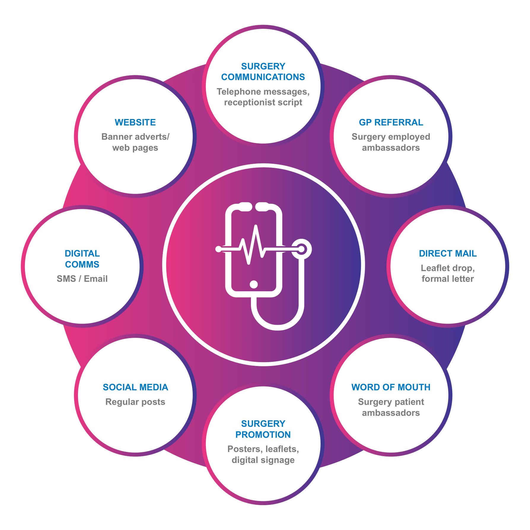
The channel plan puts the service at the centre and eight channels around it. Much of it runs through the surgery itself, from the receptionist’s script to the posters and digital signage.
Alongside the plan ran a programme of social media and SMS nudges and prompts.

Two product brands
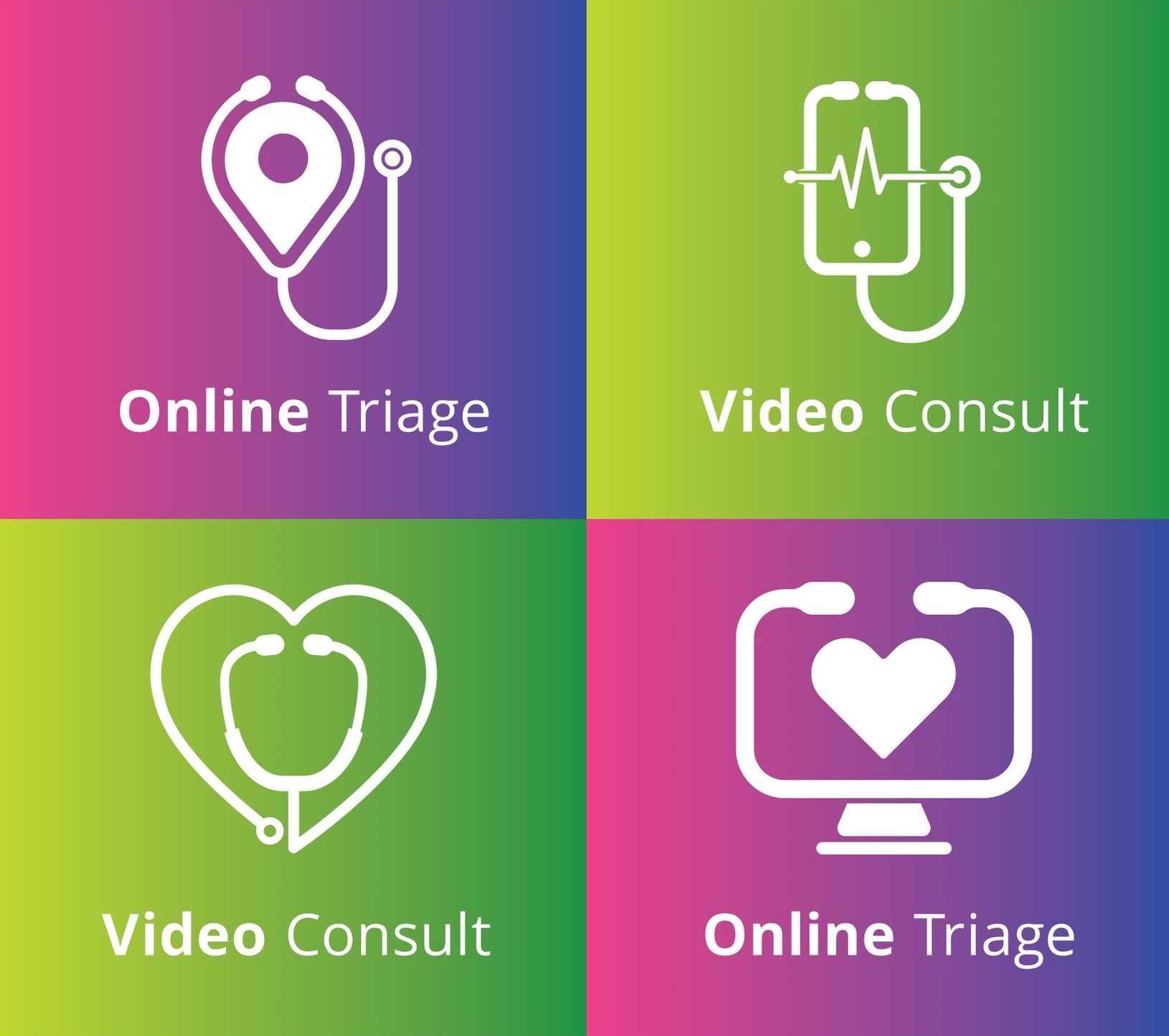
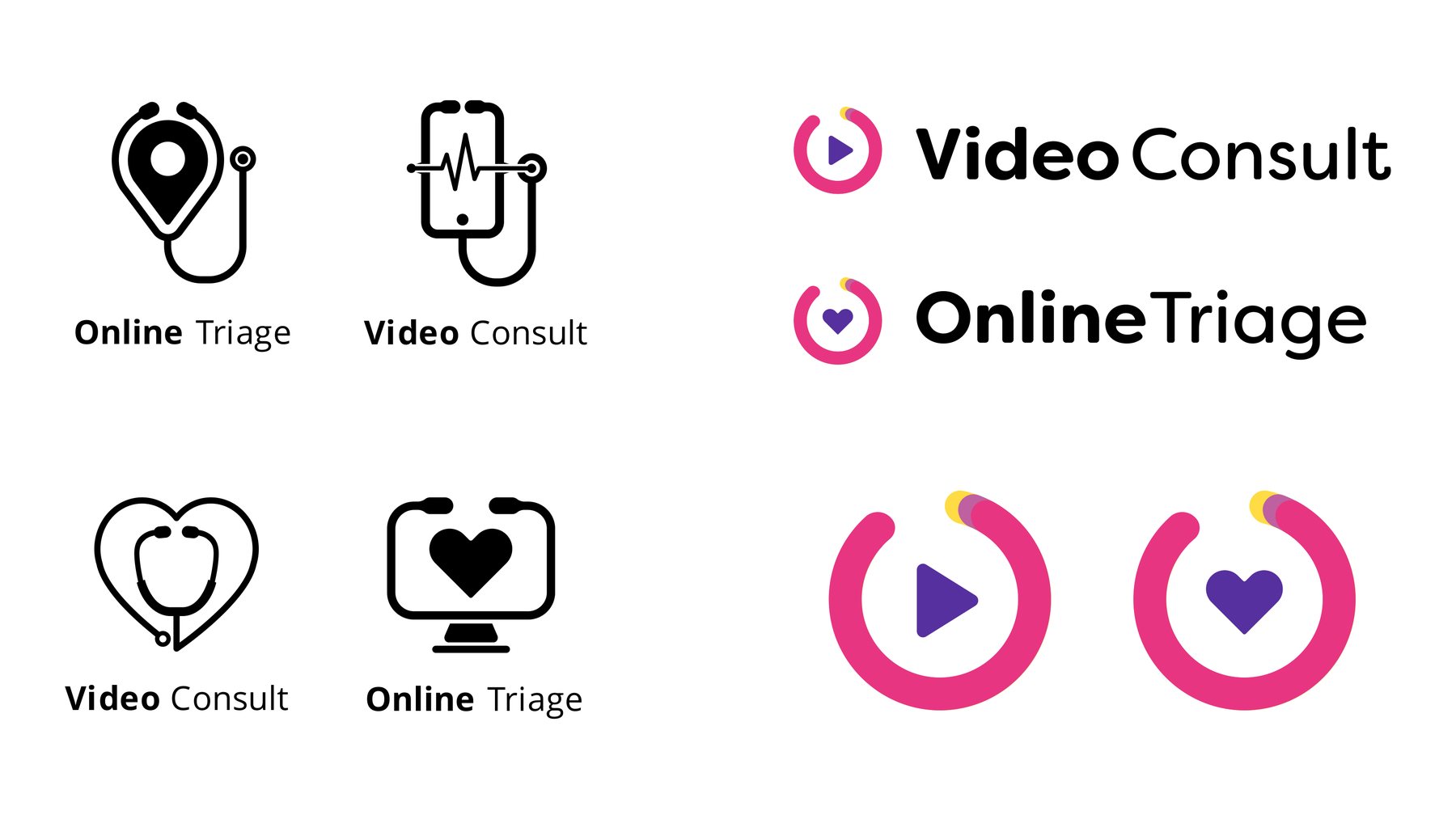
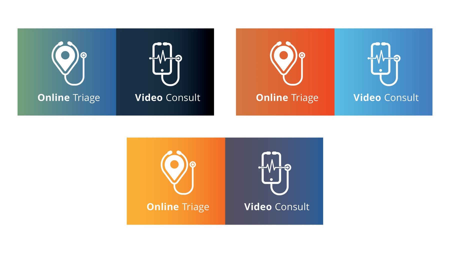
We created a product brand for each service. Online Triage is for consulting a doctor online, Video Consult for consulting by video.
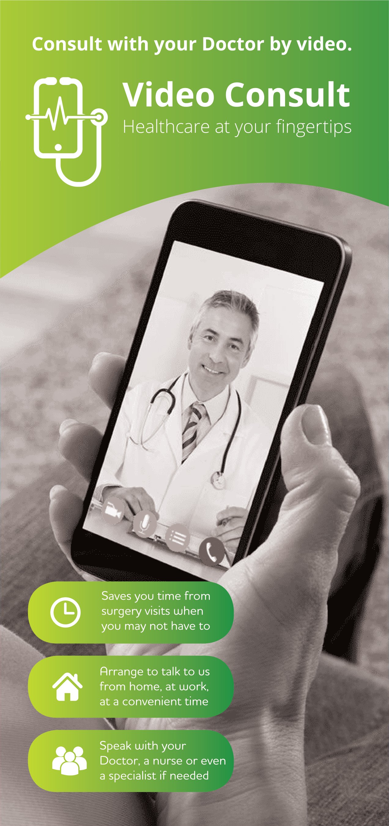
The two share a line, Healthcare at your fingertips, and a family look. Each has its own mark and colours: a heart on a screen in pink and purple for Online Triage, and a phone with a heartbeat and a stethoscope in lime and green for Video Consult.
Speaking to patients’ pains
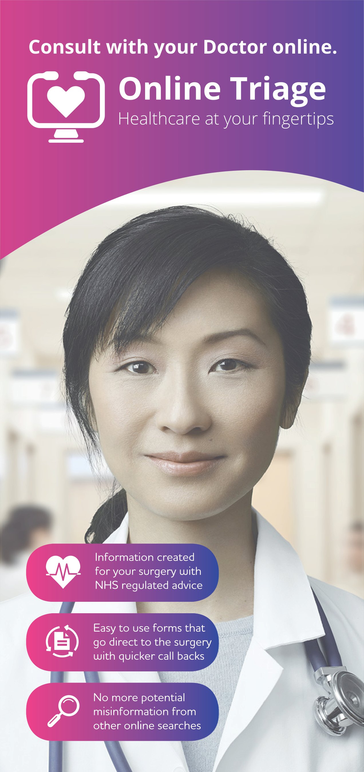
The messaging was built to meet the ‘pains’ of patients, using the nudges above to win their buy-in. Each banner answers three of them.
- The Online Triage banner offers information created for the surgery with NHS regulated advice, easy forms that go straight to the surgery with quicker call backs, and no more of the misinformation patients might find in other online searches.
- The Video Consult banner offers less time lost to surgery visits that may not be needed, a talk from home or at work at a convenient time, and a doctor, a nurse or even a specialist if needed.
Tool kits for surgeries
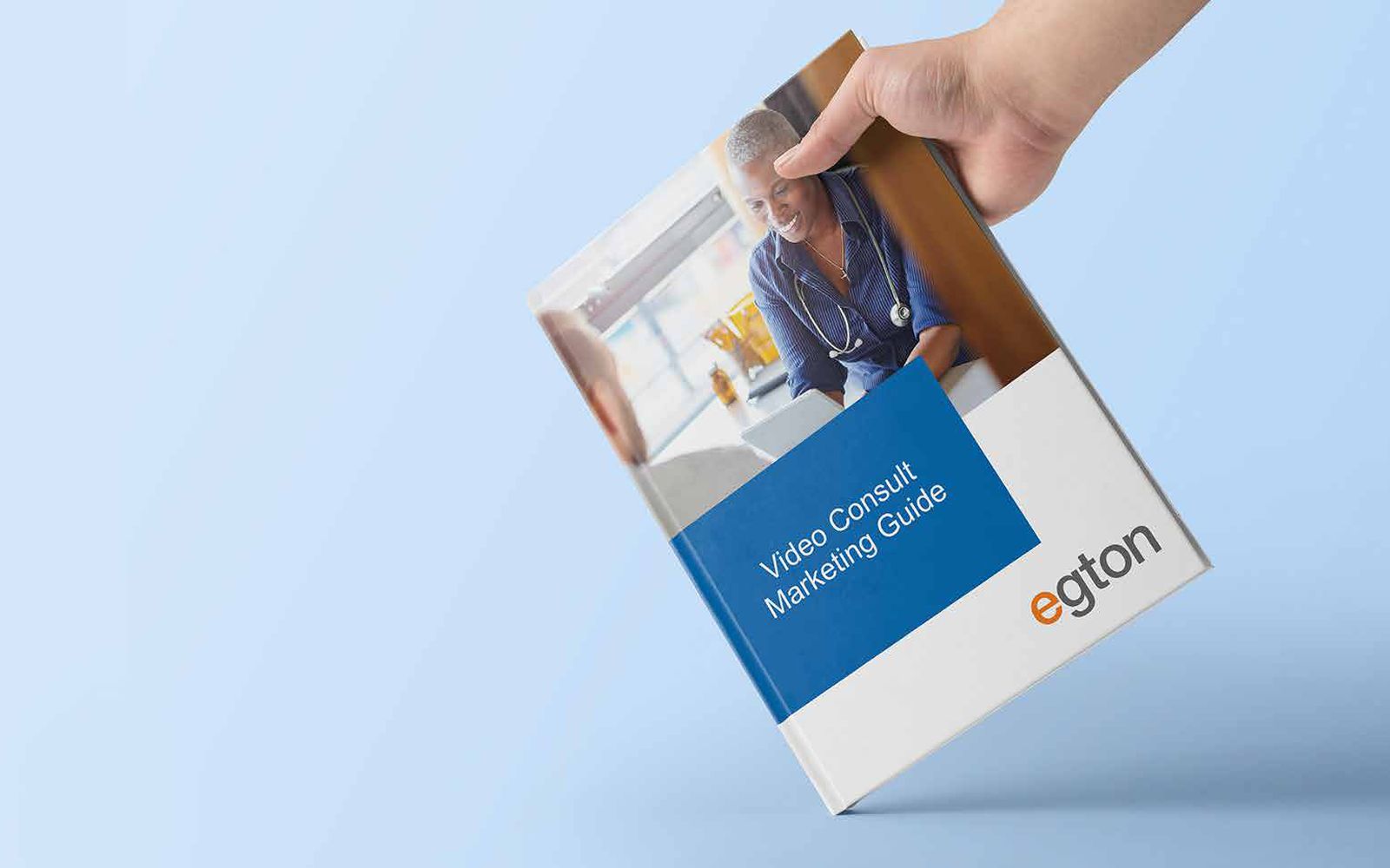
Much of this runs through the surgeries, so we made marketing tool kits for them, with a suite of marketing material. The Video Consult Marketing Guide is one of the pieces.
This one’s a favourite of mine, because we listened first. We asked patients, surgeries and doctors what would persuade someone to consult their surgery online or by video. Then we made a brand for each service, messaging that spoke to patients’ frustrations, and marketing tool kits for the surgeries.