Relaunching YMCA Bedfordshire as IMPAKT
Helping YMCA Bedfordshire undertake a brand refresh and relaunched with their new name, Impakt.
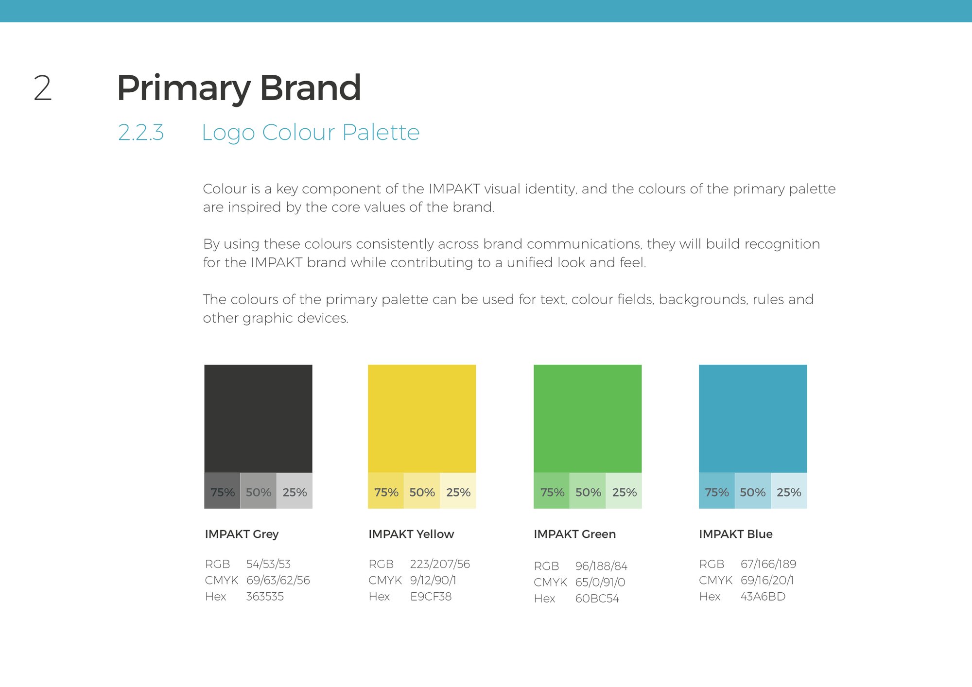
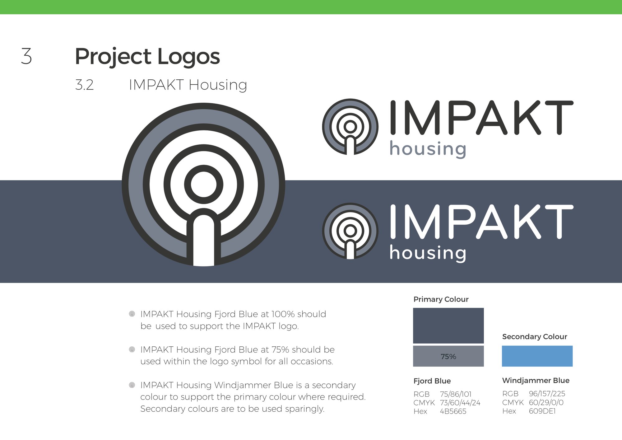
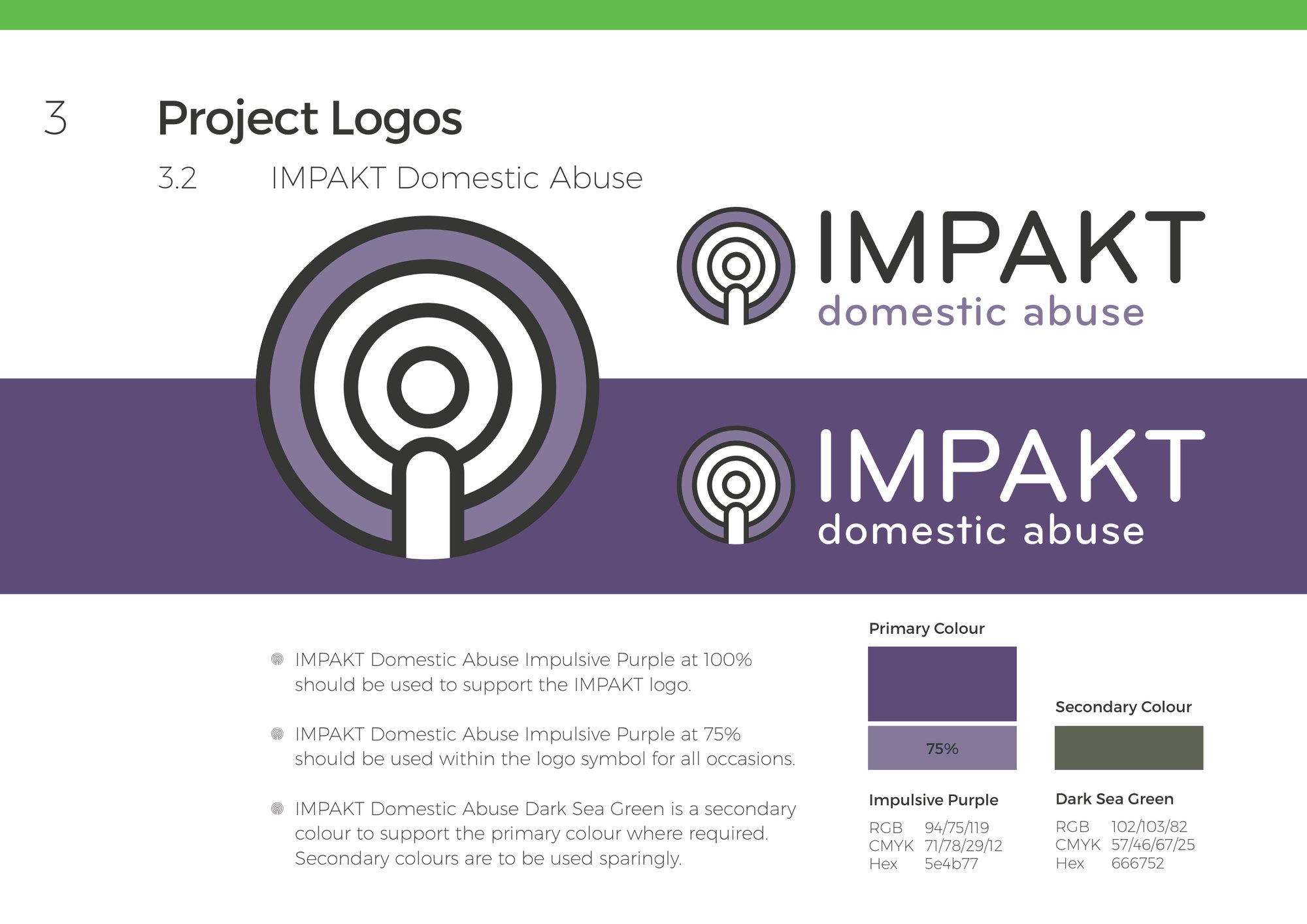
New brand launched and supported by 7 sub brands, comprehensive guidelines, numerous online and offline design creations, and bespoke concepts to support creation of building signage and living interiors.
The brand and its sub brands
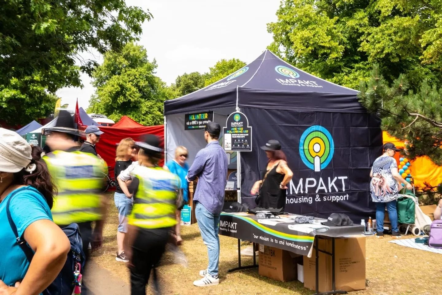
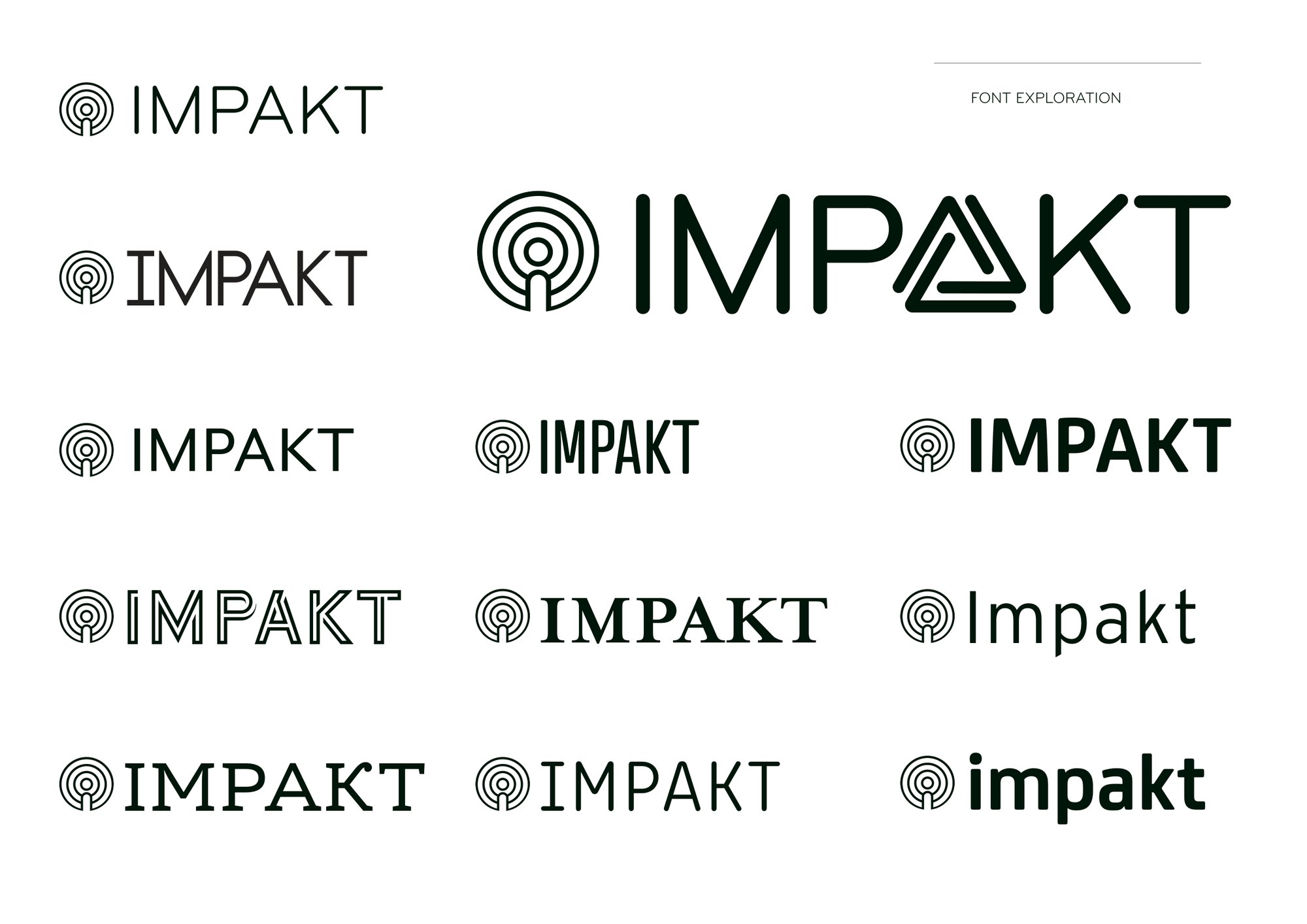
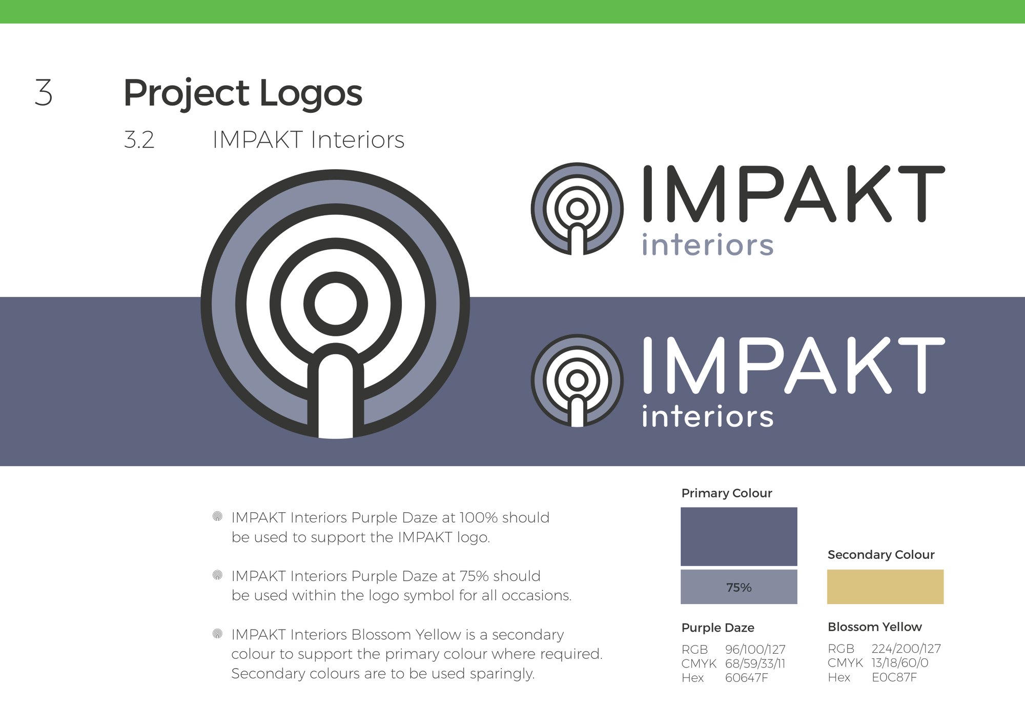
The emblem consists of three circular lines, paying homage to the core brand values. Our starting point was to look at the core activities the charity operates in and match them to symbolic lines and shapes. Tree rings for growth, urban grids to represent homes and housing, topographic maps that represent communities and fingerprints that represent people, individuality and making a mark.
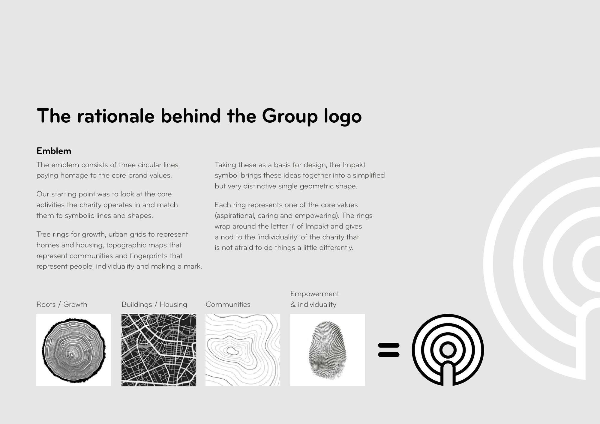
Taking these as a basis for design, the Impakt symbol brings these ideas together into a simplified but very distinctive single geometric shape. Each ring represents one of the core values (aspirational, caring and empowering).

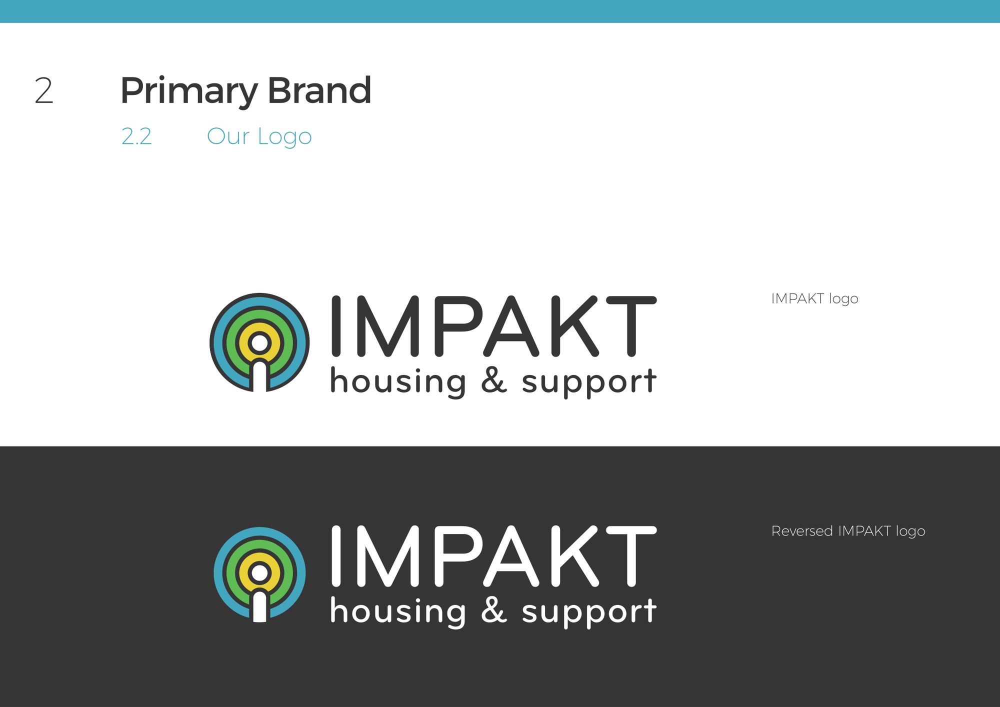
The rings wrap around the letter ‘i’ of Impakt and gives a nod to the ‘individuality’ of the charity that is not afraid to do things a little differently.
In numbers
- 7sub brands alongside the new IMPAKT group brand, in the 2021 guidelines
Helping YMCA Bedfordshire relaunch under a new name was a big responsibility, and I never took it lightly. We started from the work they do every day and the values behind it, and drew a ring for each value, wrapped around the i in IMPAKT. Then came the sub brands, the guidelines and our ideas for their signage and interiors.