A website planned around its visitors’ jobs to be done
Wellcome Connecting Science aims to enable everyone to explore genomic science and its impact on research, health and society.
We worked with Wellcome Connecting Science using part of our UX module, to assist with the design of their website.
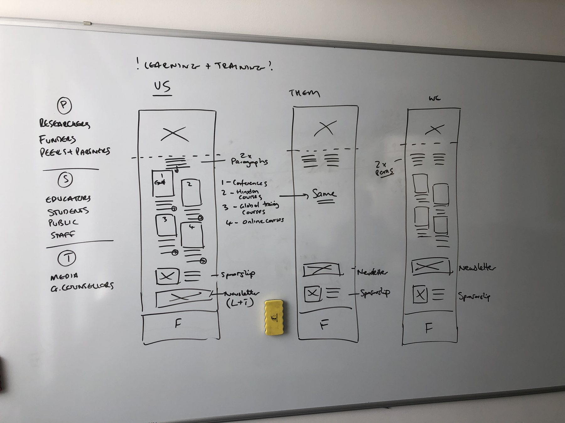
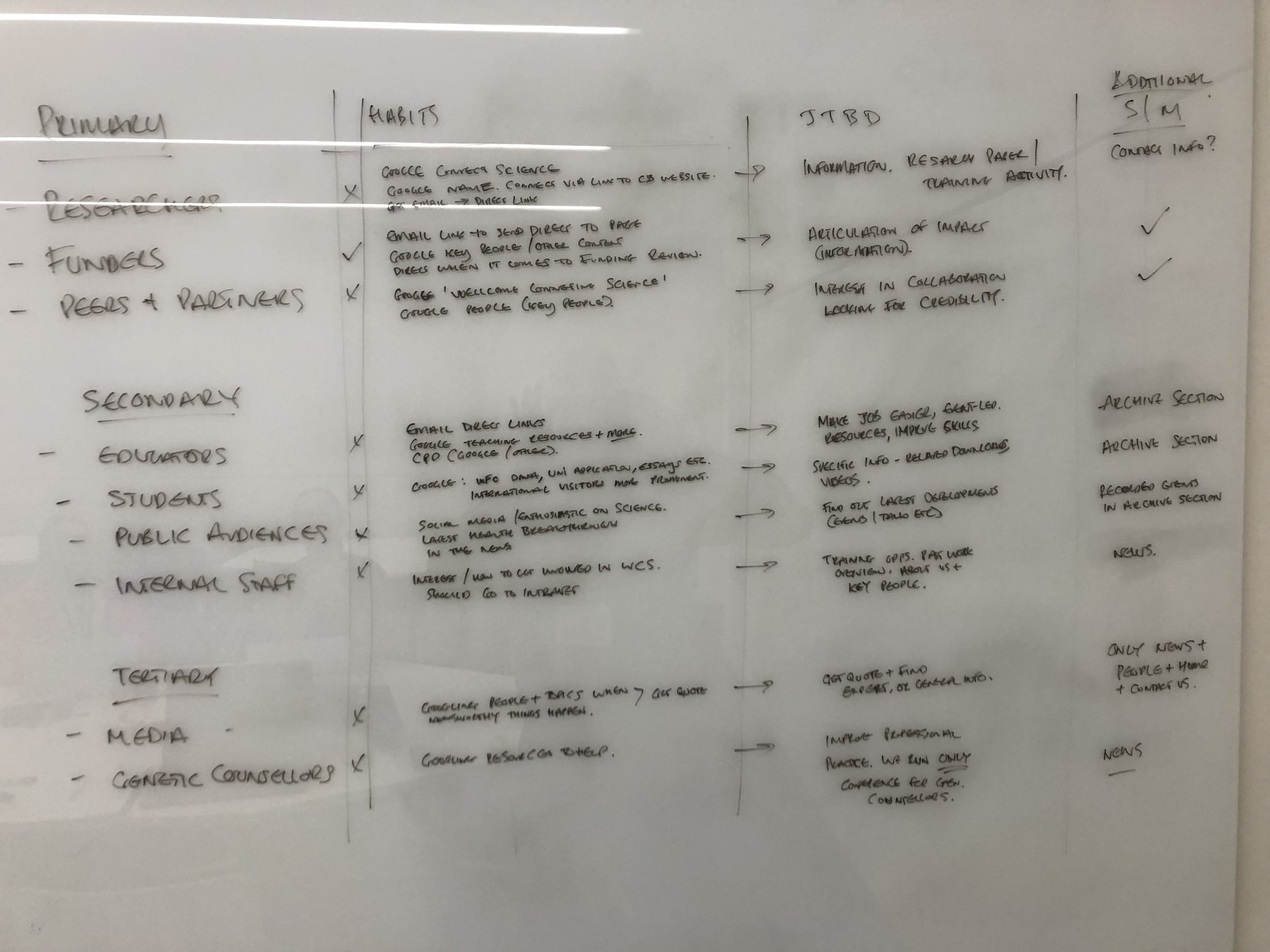
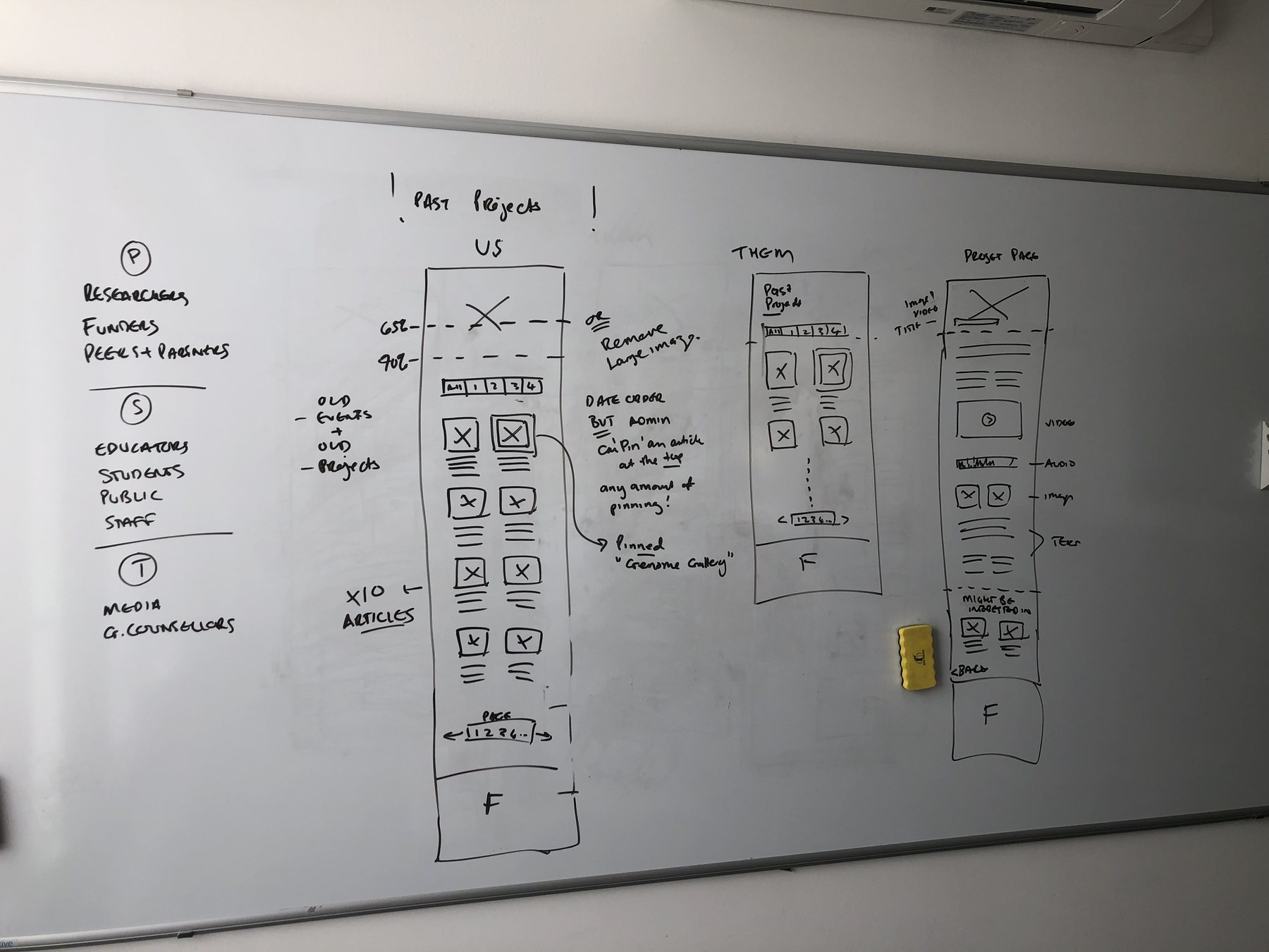
The work took place in a series of workshops over a number of days, and we consolidated it into a document with the findings and schematics. Each page was sketched on the whiteboard first, with the audiences listed down the side.
What we did
- UX workshops
- Target audiences and their existing habits
- Jobs to be done
- Proposed sitemap and navigation
- Page layouts and wireframes
- Red routes & user journeys
Three groups of visitors
We grouped the website’s audiences into three. Researchers, funders, and peers and partners came first; then educators, students and public audiences; then the media and genetic counsellors.

For each we looked at their existing habits: researchers seeking information to help with their research papers or training activities, funders looking for the articulation of impact, and partners interested in collaborations and potentially looking for credibility.
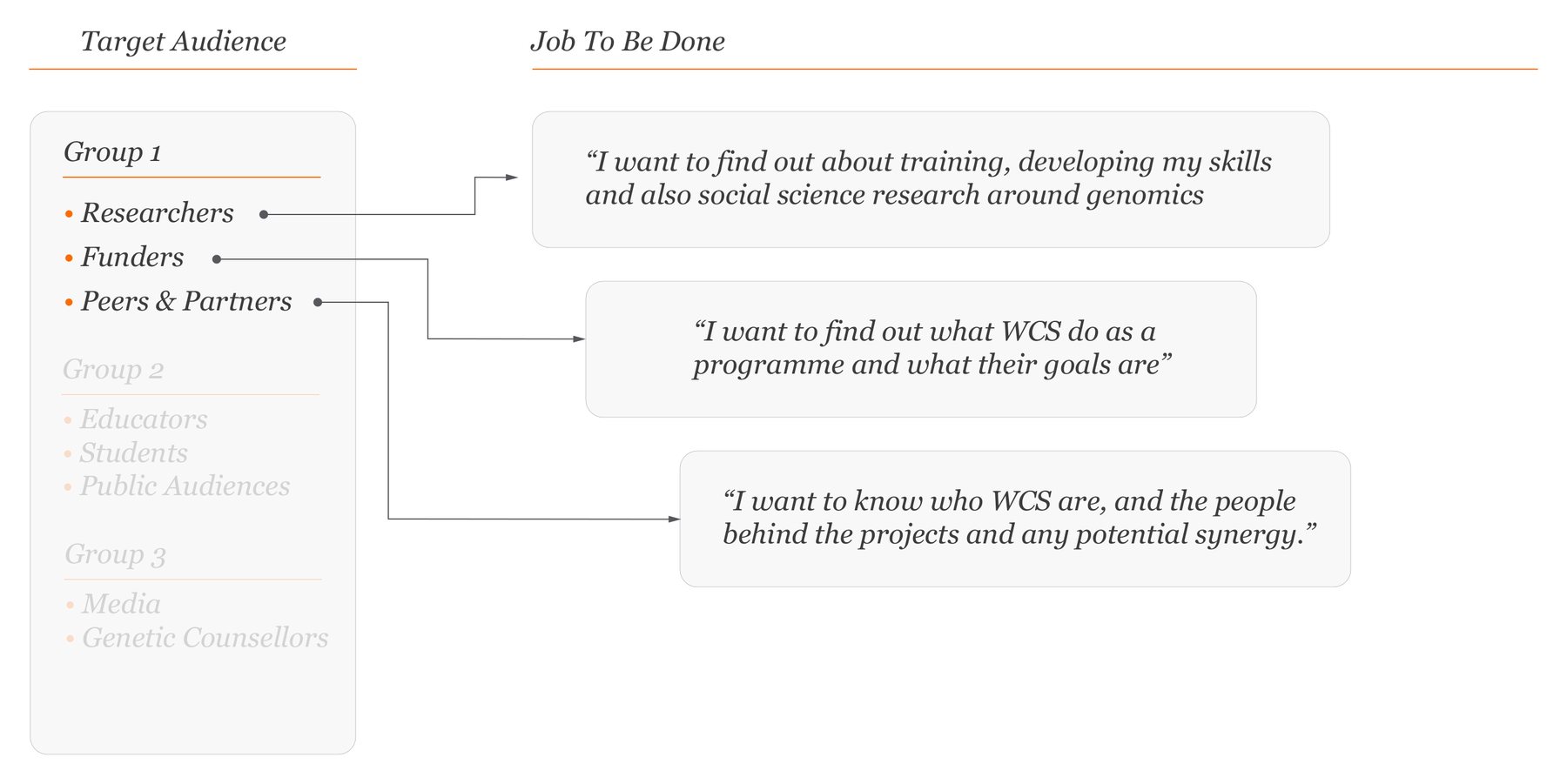
Then we asked how we could simplify these tasks, by framing each into a single job to be done.
Jobs to be done
- I want to find out about training, developing my skills and also social science research around genomics
- I want to find out what WCS do as a programme and what their goals are
- I want to know who WCS are, and the people behind the projects and any potential synergy
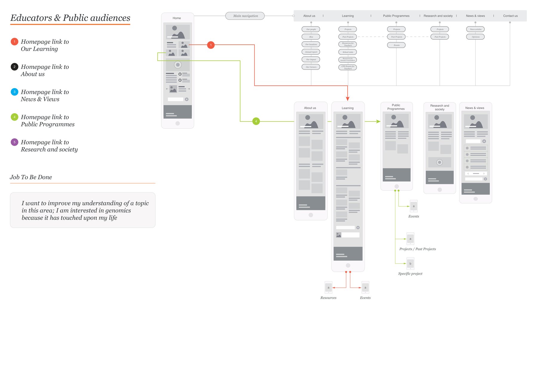
- I want to improve my understanding of a topic in this area
- I am learning and am looking to further my knowledge in this area
- I am interested in genomics because it has touched upon my life
- I need to research information related to genomics
- I want to continue to improve my professional development
A sitemap and a menu
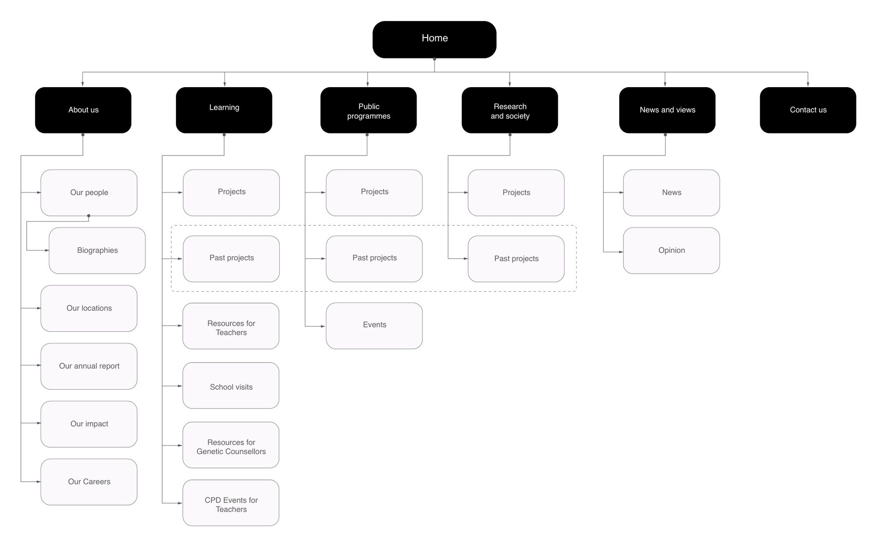
The proposed sitemap puts six sections under the homepage: About us, Learning, Public programmes, Research and society, News and views, and Contact us.
A traditional top level menu displays the menu items that will be most useful, and stays fixed at the top of the screen as visitors scroll. A hamburger menu opens to reveal the complete sitemap, expanding and collapsing.
Wireframes built from cards
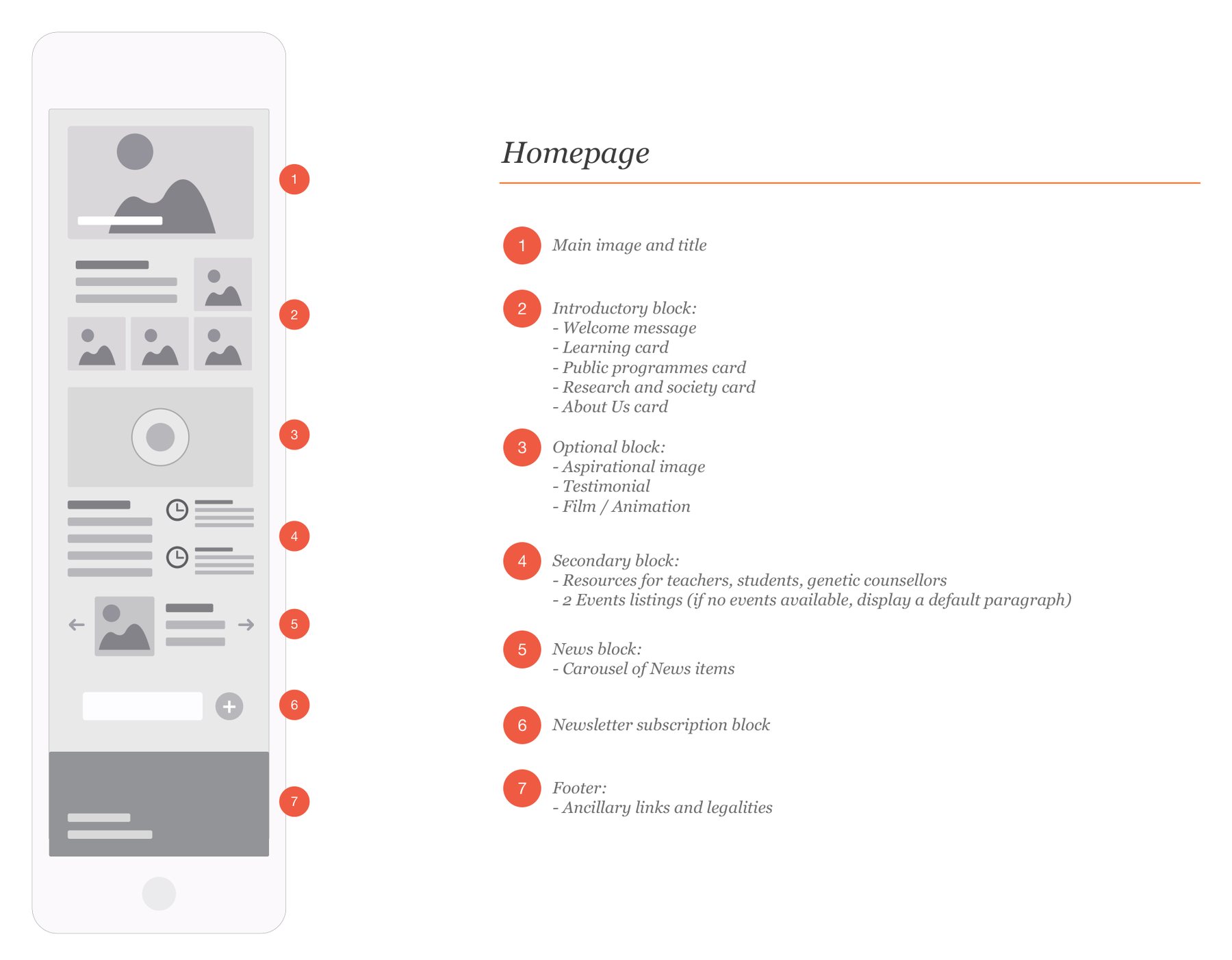
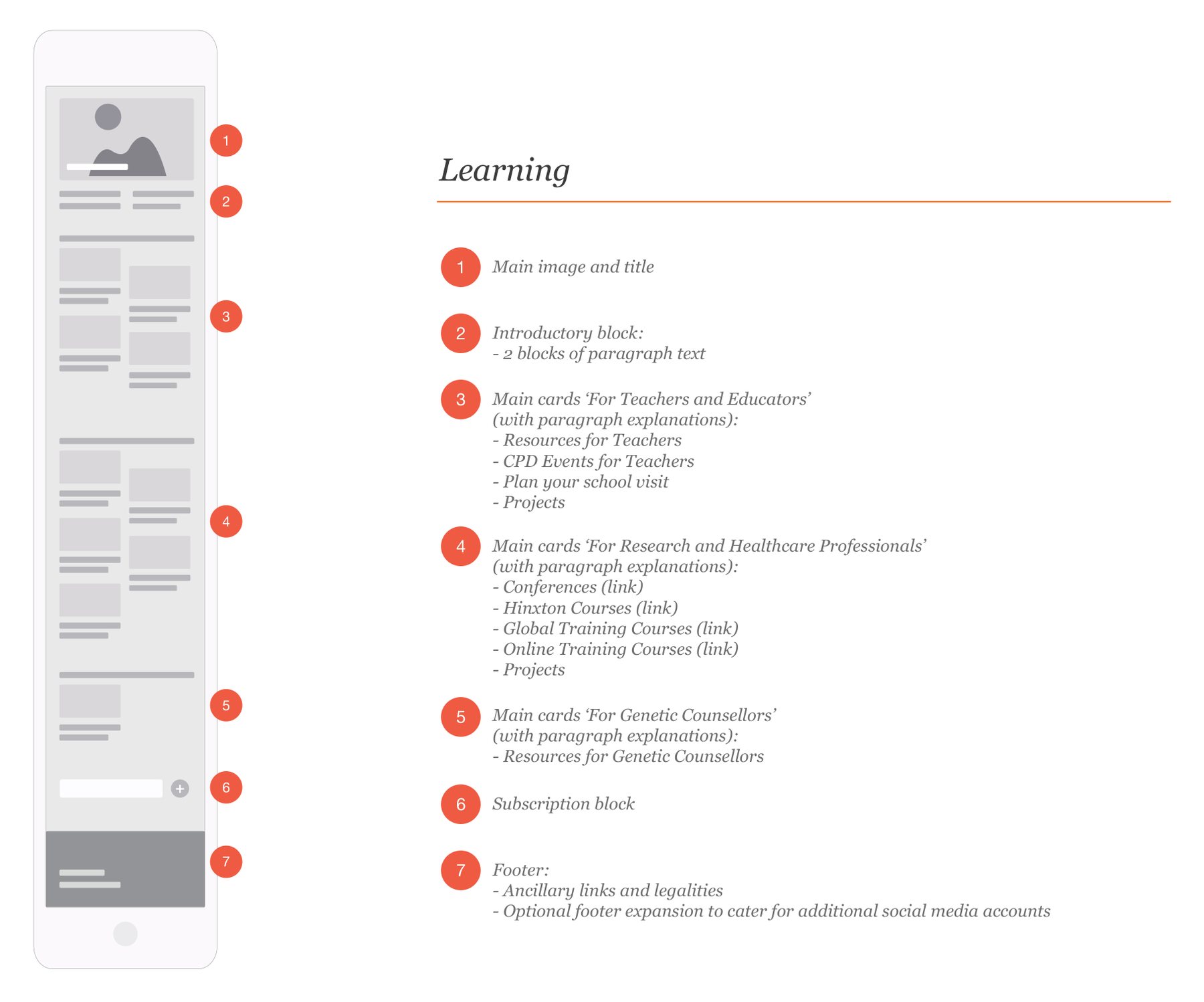
Every page was laid out as a numbered wireframe, block by block, from the homepage to the learning pages, events, projects, news, contact and search.
By cards, we refer to how text and images can be presented in a usable and appealing manner. By stacking cards unevenly, we can also suggest an order of importance and non-consciously instruct the user to look where we want them to first.
Presented consistently throughout the website and driven by the CMS, the cards give WCS a reliable way to present landing page information, and let visitors find content based on their job to be done.
Biographies open in a side panel rather than a new page, each with its own address so that people can share profiles.
Red routes
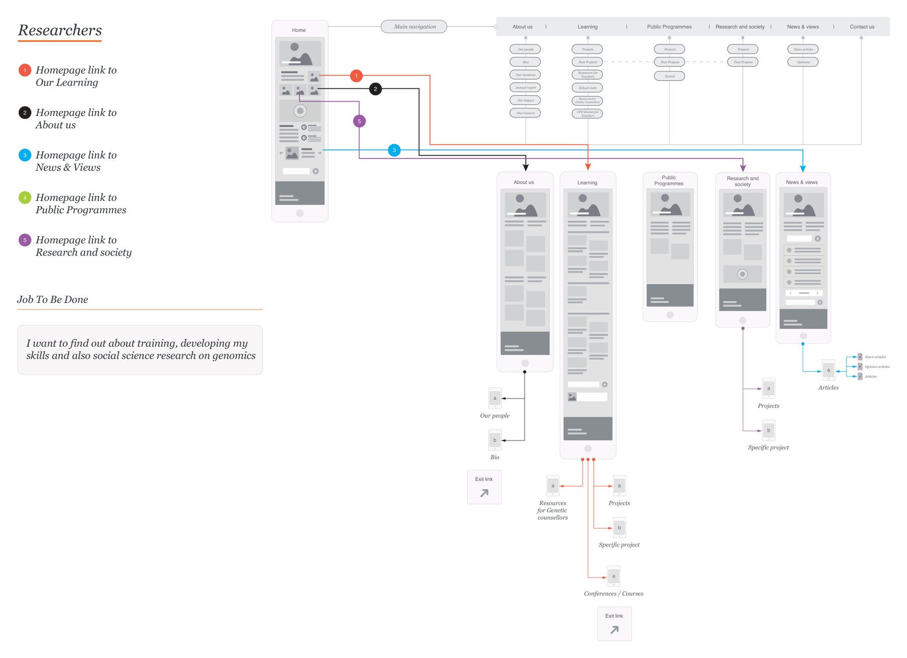
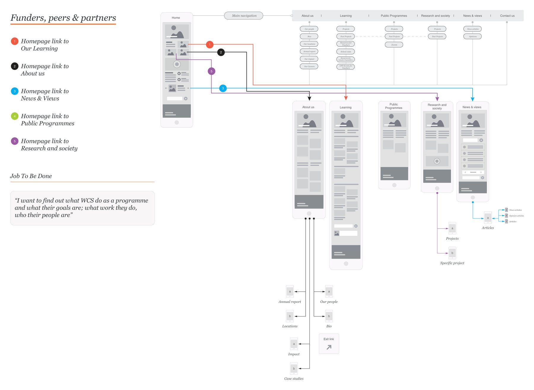
Red routes are the key tasks that users want to carry out with the product, in this case the website.
We drew one for each group: a schematic of how a visitor gets from the homepage to where they want to be with minimal effort, following their job to be done. For researchers that runs to the learning pages, courses and conferences; for funders, peers and partners to the people behind the work, its impact and the annual report; for educators and public audiences to resources, events and projects.
Next steps
The document closed with the next steps on sign off: submit the work to the relevant partners, review the initial designs and build, then deploy live and monitor results. A behavioural study and an SEO review were the longer term considerations.
In numbers
- 8jobs to be done, mapped across three visitor groups in 2022
We helped Wellcome Connecting Science plan their website around researchers, educators and the public. In a series of workshops we worked out what each of them comes to do, and drew it up as a sitemap, wireframes and red routes. The whole thing fascinated me.