In this article
Someone has read enough. They have a problem you can solve, and they go to get in touch. Then the journey starts working against them: a form with nine fields, a promise to reply "within 48 hours", a calendar asking them to book a slot before anyone has said hello. Each step sheds a few more of the nearly committed, and none of them tells you.
The gap between "interested" and "in touch" is where most websites lose the people they have already won. It is also one of the cheapest places to fix, because these people have done the hard part themselves. The journey only has to stop getting in their way, whether the last step is an enquiry, a referral, a booking, a job application or a donation.
Where the nearly committed drop out
Most enquiry journeys leak in three ways. Effort: fields, clicks, logins, a page that is awkward on a phone. Doubt: not knowing what happens next. Delay: a reply promised days away. None of these looks serious on its own. Together they hand a busy person a reason to say "later", which usually means never.
| The moment | What the journey often asks | What the visitor wonders | Try instead |
|---|---|---|---|
| Finding the way in | Hunt for a contact link in the footer | Do they want to hear from me? | The same clear next step on every page |
| The form | Nine fields, most of them required | Why do they need all this to say hello? | Three fields, the rest in the conversation |
| Straight after | A bare thank-you | Did it work? Who reads this? | A thank-you page that says what happens next |
Design it backwards from the moment of intent
Many enquiry forms are built forwards from the business: what sales wants to know, what the CRM needs, what the monthly report wants. Turn it round. Start at the moment someone decides to reach out, and ask what the least effort is that gets them to a useful next step. Usually it is far less than the current journey asks. Every field, click and delay you remove returns some of the people who were already going to contact you and gave up halfway.
Design the enquiry from the visitor's intent, not the company's convenience. Ask for less, sooner.
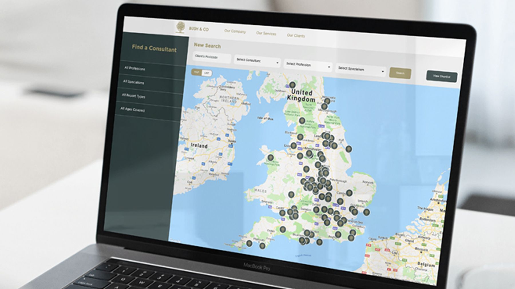
Intent is not the same for everyone, which is why the research comes first. For Bush & Co, we interviewed the solicitors and insurers who actually choose them. Among the themes that kept coming back, solicitors searched overwhelmingly by geography first, and they were cautious by nature, so trying someone new needed a push.
That changed the website. We built the consultant finder at the top of this page: a visual map, filtering by specialism, geography and experience, where solicitors can shortlist, download CVs and record their searches. A cautious person who thinks in places first can look before they commit. See the Bush & Co work.
On the rehabilitation side of HCML, insurers and solicitors choose by location and specialism first, so the case manager finder we built lets them search that way. That is human-centred design in practice: find out how people really decide, then build the route they would have drawn themselves.
Ask for three things, not nine
The contact form that demands nine things can almost always ask for three: a name, a way to reply and a line on what they need. The rest can wait for the conversation.
The urge to qualify hard at the form is understandable. But we find it loses more good enquiries than it filters out bad ones. A long form screens out anyone short of time, and good fits are often short of time too. Make the first step tiny, and the qualifying happens naturally in the reply.
For every field, ask three questions:
- Do we need this to send a useful reply?
- Could we ask it in the first conversation instead?
- Would we still want this enquiry if the field were left blank?
If the answers are no, yes and yes, the field can go. The law points the same way. Under UK GDPR, personal data must be "adequate, relevant and limited to what is necessary", the principle known as data minimisation.
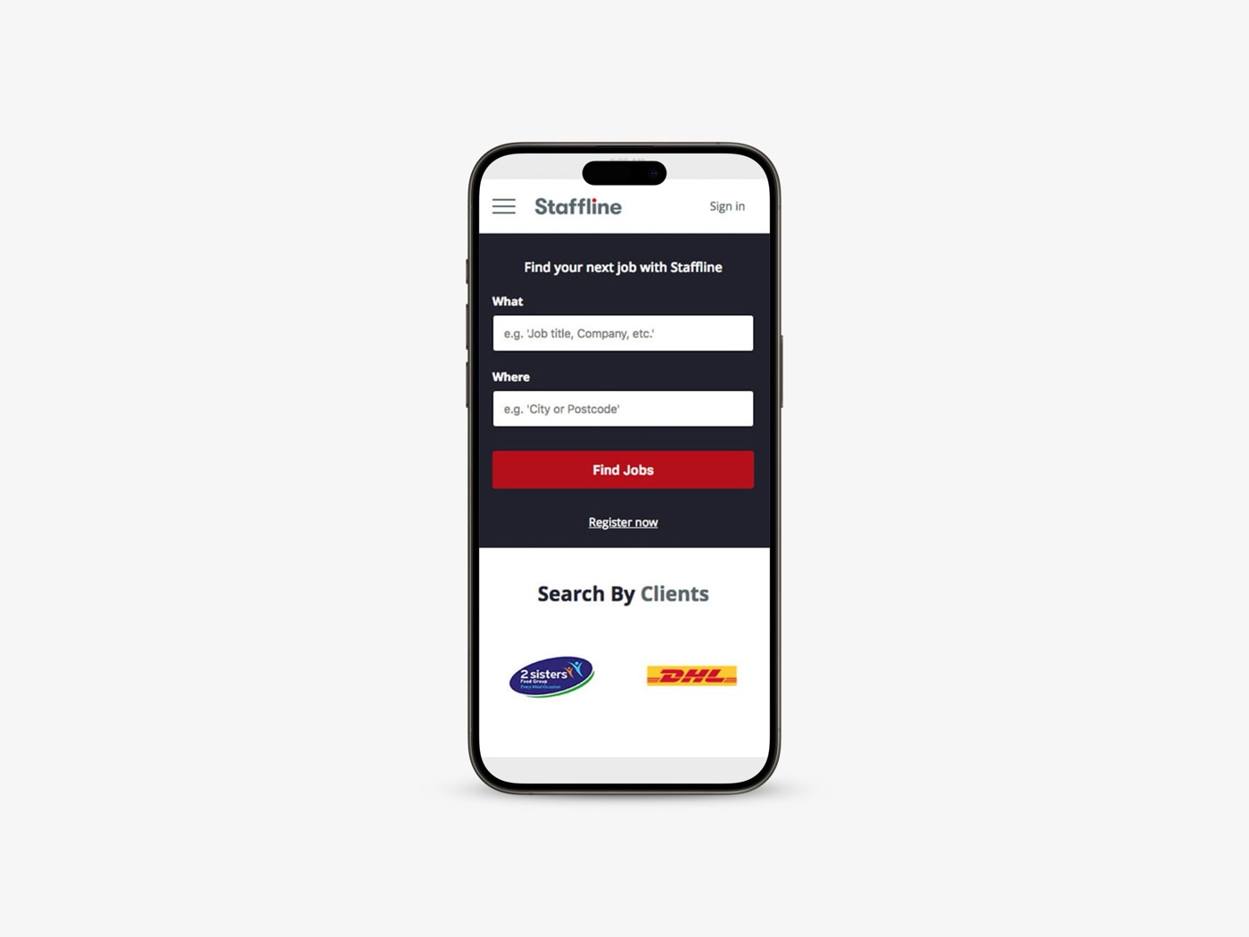
It holds for any journey that ends in a form. Our analysis for Staffline, the largest provider of blue collar recruitment in the UK, found candidates struggling to find jobs through search engines, then struggling to apply even when they did. After a six week audit and workshops with clients and candidates, we rebuilt the site mobile first: a search that asks two things, what and where, and a streamlined application that made applying far quicker. Mark Underwood, Staffline's Managing Director, said the new site "immediately increased both traffic and job applications".
Uncertainty is friction too
"What happens after I send this?" is a question most forms leave unanswered, and the silence makes people hesitate. Will I get a call I did not ask for? How long before anyone replies?
A single line beside the button settles it. "We'll reply within a day with a short call suggestion" removes the doubt and makes the step feel safe. It costs nothing, and it is easy to try on your own form.
Then carry it past the button, with a thank-you page that says who will reply, how and by when. And keep the promise. A reply time you can't keep is worse than none, because the first thing they learn about you is that your word slips.
The same next step, wherever they decide
People rarely decide on the contact page. They decide halfway through a service page, or at the end of a case study. Wherever that moment comes, the next step should be right there, and the same every time. The Anglia Interiors website we designed and built works this way: every page leads to the same next step, a design visit. More on that in why one clear call to action beats five, and on the quiet pull of required fields in why defaults quietly decide more than your sales pitch. From an advert, the landing page should keep the advert's promise and lead to that one action.
Map it, then walk it
The quickest way to find the leaks is to go through the journey as a stranger would: on a phone, starting halfway into the site, with a real question in mind.
- 01Start where they start
Open a service page or an article, and time how long it takes to find the way in.
- 02Count the effort
Every field, click and page load. Ask why each required field is required.
- 03Count the doubt
Every moment you are not sure what happens next, or when someone will reply.
- 04Send it for real
Submit the form and see what arrives, and how long it takes.
- 05Watch someone else
Ask a person who fits your audience to try it, and say nothing while they do.
A plain map of every step, the ways out included, shows where people have to stop and think.
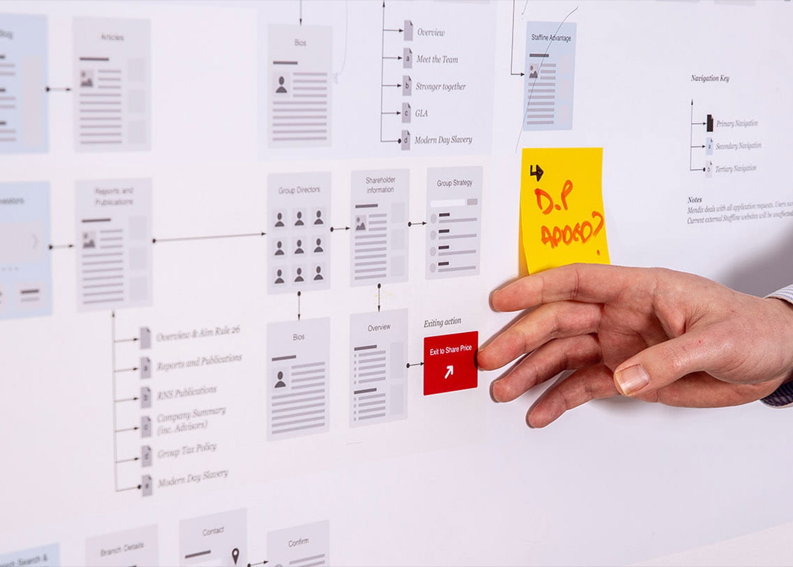
On Staffline, the map was one part of a much bigger job.
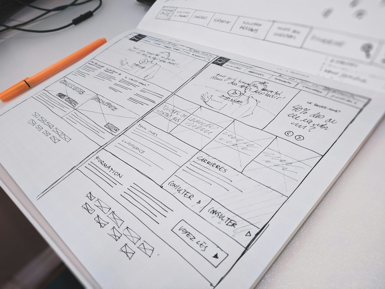
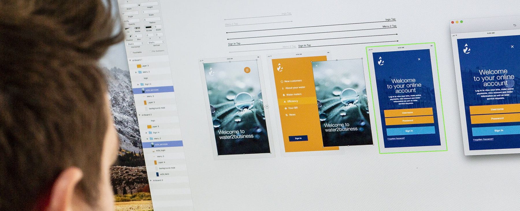
The Ideate team worked with us on a full user experience journey, including meticulous research and planning on competitor and data analysis right through to detailed sketches, prototypes and behavioural design.
Fewer steps, more conversations
Most of this needs no new website. Cut fields, rename a button, add a line about what happens next. Each moment of effort or doubt you remove is a few more conversations you'll actually get to have.
If the journey is a symptom of a site that does not explain the value, that is what a website redesign is for. The thinking underneath all of it, making the right step the easy step, is behavioural design.
Common questions
How many fields should an enquiry form have?
As few as you need to send a useful reply: usually a name, an email address or phone number, and a line on what they need. Anything more can be optional.
Won't a shorter form bring us more time-wasters?
A poor-fit enquiry costs you a short, polite reply. A good-fit enquiry lost to a long form costs you the whole relationship, and you never see it happen. Qualify in the conversation, where a person can do it kindly.
Should we swap our form for a booking calendar?
Offer both if you can. A calendar suits people who already know they want a call. For someone with a quick question, a grid of half-hour slots asks for a commitment they have not decided to make. Make the lighter option the first thing they see.