In this article
Count the things your homepage asks a visitor to do. Book a call, download the guide, read the blog, follow us on LinkedIn, sign up to the newsletter, get in touch, see our work. Each was added with good intentions. Together they make a page that asks for everything, and a page that asks for everything tends to get nothing.
That is not because visitors are lazy. A choice between seven equal options is still a choice, and most people arrive only half committed. Faced with a menu, the easiest decision is no decision. They read a little, mean to come back, and close the tab.
More choice feels generous. It isn't.
Adding another button feels like a kindness: more ways in, more chances to say yes. In practice every option adds a small decision. Decisions take effort, and effort is what people avoid when they are not yet sure. The page with one obvious next step is easier to act on than the page with a menu, and easier is what gets done.
The Hick-Hyman law, from experiments in the early 1950s, describes how the time it takes to choose grows with the number of options. The best-known study of choice overload, Sheena Iyengar and Mark Lepper's jam tasting stall in a Californian supermarket, published in 2000, found shoppers were more likely to buy when offered fewer flavours.
The effect is not universal. A review pooling many studies (Chernev, Böckenholt and Goodman, Journal of Consumer Psychology, 2015) found overload shows up when options are hard to compare, when people are unsure what they want, and when they would rather get the decision over with. That describes most people on a page for the first time.
A page that asks for everything gets nothing. Pick the one action that matters and make it obvious.
Behavioural design starts from that observation. People tend to take the easiest path, so the job is to make the most useful path the easiest one.
Decide what each page is for
The real value of one call to action is the discipline it forces. Someone has to decide what a visitor should actually do next. That conversation is often harder than the design, because every option on the page has an owner who thinks theirs matters.
The answer depends on the organisation. For a professional firm it is usually to start a conversation. For a recruiter's candidates it is to find a job. For a charity it might be to give. For a kitchen company it is to get a designer into someone's home.
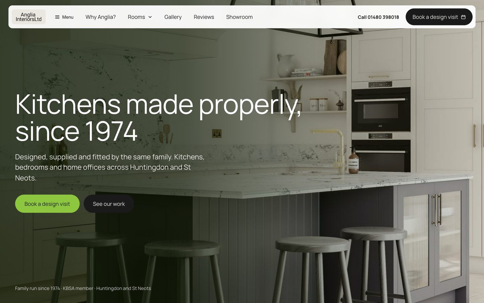
Anglia Interiors has designed, supplied and fitted kitchens, bedrooms and home offices from its Huntingdon showroom since 1974. On the website we designed and built for them, every page leads to the same next step, a design visit. The homepage asks twice before you scroll, once in the header and once in Anglia's green under the headline. See our work sits beside it in a darker button, there for people who are not ready yet. It does not compete.
Not removed, just not competing
One primary action does not mean deleting everything else. Some visitors really do want the guide or the case studies. Those options simply stop drowning the one that matters. A simple ranking helps.
| Kind of action | How it looks | Where it lives | Examples |
|---|---|---|---|
| Primary | The one filled button, same words every time | Near the top, after each section that answers a doubt, and at the end | Book a design visit, Find jobs, Donate |
| Secondary | A quieter button or a plain text link | Beside or below the primary, never louder | See our work, Register now, Download the guide |
| Everything else | Ordinary links | Navigation, the footer, the end of an article | Follow us on LinkedIn, Read the blog, Careers |
The phone at the top of this page shows it at work. Staffline, the largest provider of blue collar recruitment in the UK, was finding it hard to source candidates. Our research found candidates struggling to find jobs through search engines, then struggling to apply. So the rebuilt site is job search heavy and mobile first: what, where, one red Find Jobs button, and Register now beneath it as a plain link. Both matter. Only one is loud. Behind the button, we streamlined application and registration so applying took far less time. See the Staffline work.
Repeat it as people scroll
This does not mean one button on the whole site. It means one primary action per page, obvious at every scroll depth. Some people are ready at the headline, others want the detail and the proof first. The same action, in the same words, should be in reach whenever each is ready. What changes is how many different things you ask, not how many times you ask.
Word the button for what they get
Submit and Click here describe what the visitor does with their mouse. Learn more describes almost nothing. Good button words describe what they get. Book a design visit. Find jobs. Each says exactly what happens next, which takes away a small worry before the click.
The best words come from the people you are designing for. That is human-centred design in practice: their words on the button, not yours. Good copywriting does the rest.
When a page has two real jobs
Some pages genuinely have two different jobs to do. Then give each a clearly labelled door, and keep it to two rather than seven.
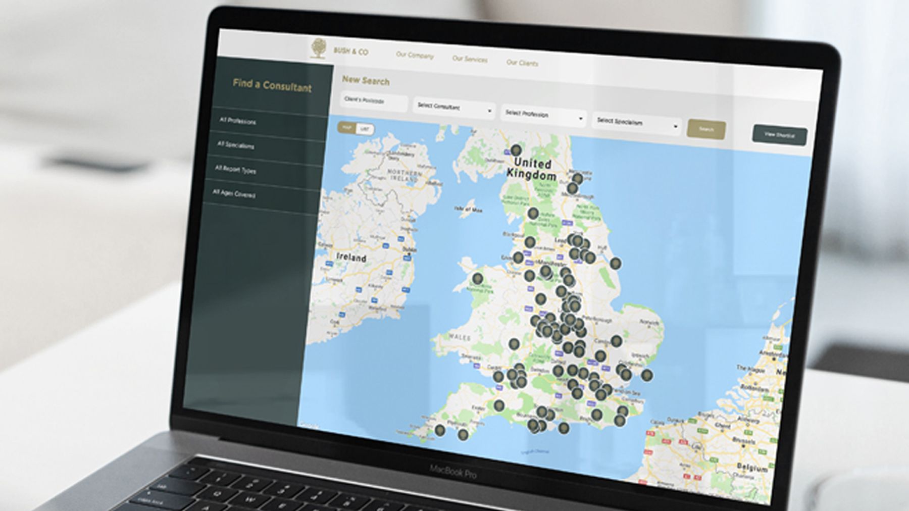
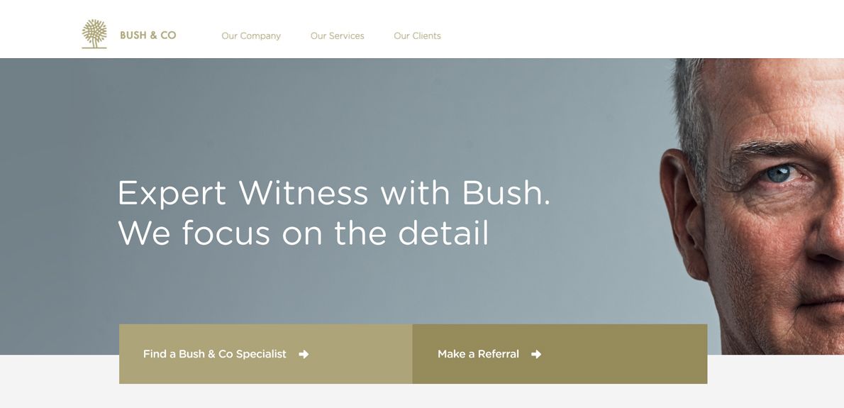
Bush & Co, the case management and expert witness firm, is one. When we interviewed the solicitors and insurers who choose them, simplicity in finding a consultant kept coming up, so we built a consultant finder on a map. On a phone, their homepage opens with two buttons: Make a Referral, and Find a Bush & Co Specialist. Each is named for a task someone arrives to do.
Landing pages: one campaign, one action
Someone who clicks an advert has already told you what interests them. Sending them to a homepage with seven options throws that away. A good landing page keeps the advert's promise and asks for one thing.
For Sayfa Systems, a supplier of safety products for working at height, we created an SEO and PPC strategy to bring targeted traffic to the site, and landing pages for specific digital campaigns to aid conversions. More on PPC and landing pages.
They also advised us on SEO and PPC strategy resulting in increased conversions and leads.
Even when nothing is for sale
A call to action answers the question every reader is left with: what do I do now? That holds for a charity appeal or a public service as much as for a product.

When the Gangmasters and Labour Abuse Authority and three corporate partners wanted a film on modern-day slavery in the workplace for UK businesses, we started with what already existed. Most films talked about the signs of slavery. Very few said what to do once you had decided to take the next step, in a way that kept everyone involved safe. That gap became our starting point for the creative concept. More on film and animation.
Check your own page in ten minutes
- 01List every ask
Write down every button and link that asks the visitor to do something.
- 02Choose the one
Pick the action that matters most on this page. If two people disagree, that conversation is the real work.
- 03Rank the rest
Mark each item secondary, footer or gone, and style it to match.
- 04Check every scroll depth
Wherever someone might be ready to act, the primary action should be in reach, in the same words.
- 05Rename the button
Swap Submit, Learn more or Click here for what the visitor actually gets.
Then ask someone who fits your audience what they would do next. If they hesitate, something is still competing.
The easy thing, easy to find
Do it well and more people tend to act, not because you persuaded anyone harder, but because you stopped making the easy thing hard to find.
If the clutter comes from a site that has grown by addition, a website redesign is the chance to decide what each page is for. What happens after the click matters too: see designing an enquiry journey people finish, and for the top of the page, why your homepage headline is costing you enquiries.
Common questions
What about the navigation menu?
Navigation is for finding your way, not for asking. Keep it plain. If the header carries a button, make it the page's primary action, not a new one.
Should the main button sit above the fold?
Yes, for the people who are ready. Many are not, so repeat it after the sections that answer their doubts.