In this article
Here is an uncomfortable truth for anyone who has laboured over a sales deck. The option you set as the default will often beat the argument you make for a different one. The pitch matters. The default often matters more.
This isn’t a trick. It is how people behave when they are busy and the stakes feel manageable, which is most of the time. So a lot of the decisions you think you are winning or losing on persuasion are actually being settled by what you made easiest.
What a default is, and why it wins
A default is whatever happens if someone does nothing. The box already ticked, the plan already highlighted, the route the page assumes you will take.
Defaults win for three plain reasons. Choosing takes effort, and accepting takes none. A default reads as a recommendation, because surely someone thought it was the sensible choice. And moving away from it feels like a risk you now own. Busy, capable people lean on defaults precisely because they have better things to think about.
The clearest example in Britain is workplace pensions. From 2012, automatic enrolment switched the default from opting in to opting out. Anyone could still leave. What changed was what happened if you did nothing.
- 55%of eligible employees in Great Britain participating in a workplace pension in April 2012, the year automatic enrolment beganDWP official statistics, 2009 to 2019, published June 2020
- 88%of eligible employees participating in April 2019, once automatic enrolment had been rolled outThe same DWP statistics
The Behavioural Insights Team lists defaults as the first technique in its EAST framework for changing behaviour. The people reading your website, your proposal or your donation page respond to them in much the same way.
Where defaults hide in a buying journey
Whether someone is buying for a business, for their home or giving to a cause, their journey is full of defaults, and most go unexamined. Each one nudges people down one path rather than another, whether or not anyone chose it deliberately. Most organisations never did.
| Where it sits | The default | What it quietly tells people |
|---|---|---|
| Prices or packages | The tier in the middle, highlighted | Most people like you choose this one |
| Forms | The fields marked required rather than optional | We need all of this before we will talk |
| Calls to action | The button that is filled in, not outlined | This is the next step |
| Donation or sign-up forms | The amount or option already selected | This is what people usually choose |
| After the form | What happens next, said or left unsaid | If unsaid, you are on your own now |
Make the obvious next step the easy one
The most important default on most pages is the next step, and a surprising number of pages never set one.
Decide what you want the obvious next step to be, then make it the path of least resistance.
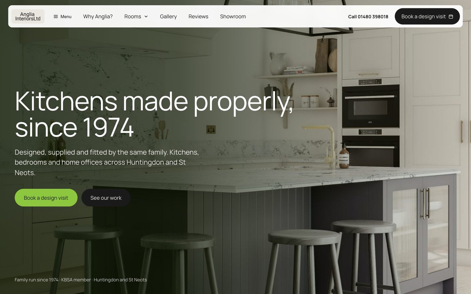
Anglia Interiors has designed, supplied and fitted kitchens, bedrooms and home offices from its Huntingdon showroom since 1974. On the website we designed and built for them, every page leads to the same next step: a design visit. There is another route, but the page never leaves you wondering which it recommends. More on this in why one clear call to action beats five.
Defaults also decide how much effort you ask for, and when. Staffline, the largest provider of blue collar recruitment in the UK, was finding it hard to source candidates. Candidates were struggling to find jobs through search engines, then struggling to apply when they did. After a six week audit and workshops with clients and candidates, we built a mobile first job search that put the candidate first, and streamlined applying and registering.

The obvious thing to do is search for a job. Registering is there, but it is not the first thing asked of anyone.
The Ideate team worked with us on a full user experience journey, including meticulous research and planning on competitor and data analysis right through to detailed sketches, prototypes and behavioural design.
The default you are up against
Every buyer has a default before they meet you: doing nothing, or staying with whoever they use now. If you are the new option, you are asking someone to leave the easy path. More argument rarely moves them. A smaller, safer first step usually does. Our own free marketing audit is a first step of that kind: three things you could fix this month, with no pitch and no tie-in.
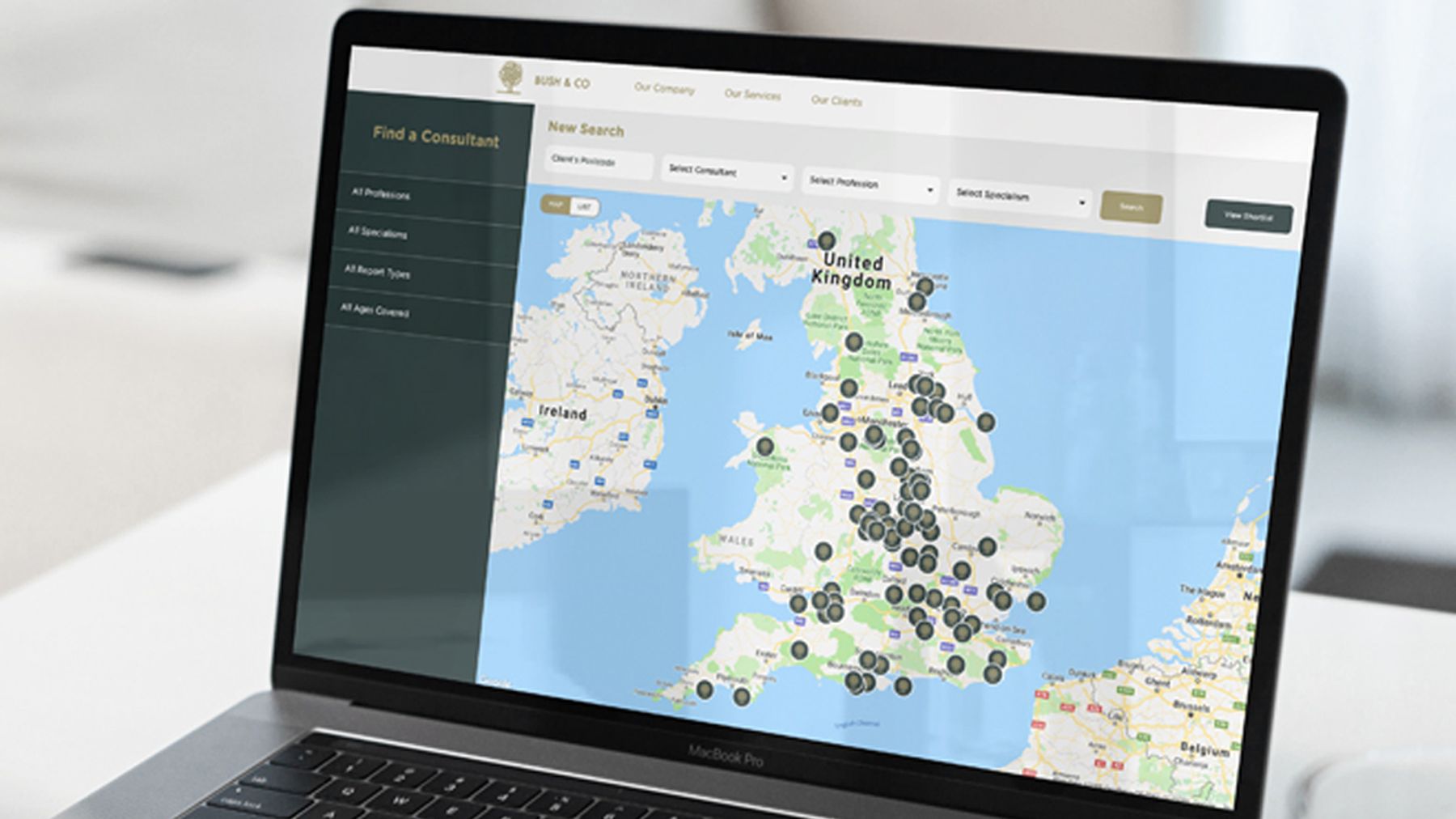
When we interviewed the solicitors and insurers who choose Bush & Co, two of the three themes that kept coming back were, at heart, about defaults. Solicitors were cautious by nature and needed a push to try someone new. And they searched for a consultant by geography first. So the consultant finder we built starts where they start, with a map.
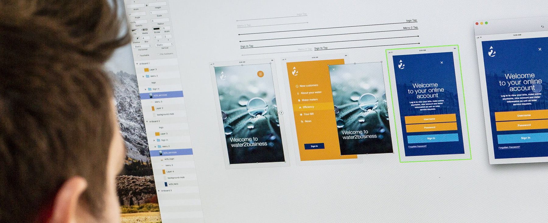
water2business faced the same default across a whole market. When the water market deregulated, businesses could choose their supplier for the first time, and staying put took no effort at all. Part of our job was making water supply matter to a busy Finance Director or Facilities Manager. Nobody leaves the easy path for a choice that does not seem worth their time.
Where the honest line sits
There is a line here, and it is worth naming. A default used well guides someone towards the choice that genuinely serves them, and saves them effort doing it. A default used badly buries the option they would actually want, so they stumble into the one that suits you. The first builds trust. The second spends it.
Richard Thaler, who wrote Nudge with Cass Sunstein, has a word for the second kind: sludge. The cancellation that takes six screens. The opt-out set in pale grey type.
In one place the law has drawn the line already. Under UK GDPR, a pre-ticked box is not valid consent, and the Information Commissioner’s Office is plain that all consent has to be an opt-in.
Everywhere else, trust is the better reason. When one organisation buys from another, buyers compare notes and relationships run for years, so spending trust is a terrible deal. Customers talk, and donors remember. When we planned a year of content for HCML, our interviews showed that the intermediaries who recommend it wanted to hear from a provider all year round rather than be bombarded. So the programme was built around ethical, behavioural nudges. We make the same case in loss aversion, used honestly.
How to check your own defaults
Walk your own journey and you will usually find a handful of small defaults quietly steering people towards friction, hesitation or the wrong option.
- 01Walk it as a stranger
Go from the first search or advert to the moment after someone enquires, buys or signs up, on a phone as well as a laptop.
- 02List every choice point
Every place someone picks, types, clicks or decides to stop.
- 03Note the current default
What is highlighted, preselected, listed first or required, and what happens if they do nothing.
- 04Ask the recommendation question
Is this the option you would recommend to a client you liked? Where it isn’t, change it.
- 05Say what happens next
After every form, tell people plainly what will happen and when.
Fixing them does more than another round of persuasion ever would. It is everyday work in behavioural design, and it starts where all our work starts, with the people making the choice. If your site needs more than a few changed defaults, a website redesign built around how people actually decide is the bigger version of the same idea. Either way, we are happy to talk it through.
Common questions
Isn’t setting defaults manipulative?
Only if the default serves you at the buyer’s expense. Set the honest recommendation as the default and you are reducing their effort, not exploiting it.
What is the most important default on a website?
Your primary call to action. If a page offers several equally weighted next steps, none is the default and people stall. Pick one obvious next step and make it the easy one.
Do defaults still matter when the decision is long and considered?
Yes, arguably more, because those journeys have more steps and more points where effort causes drop-off. Defaults reduce the effort at each step, which matters most when the overall decision is long.
Does this apply to charities and the public sector?
Yes. Automatic enrolment is itself a default set by government. For a charity, the amount already selected on a donation form is a default too. The same honest test applies.