In this article
Most homepages open with a line that says almost nothing. "Welcome to [company]." "Your partner in [vague outcome]." "We help businesses grow." The words are warm, professional and completely interchangeable, which is the problem. The one piece of space every visitor reads is spent telling them something they already assumed.
The headline is not decoration. Nearly everyone who lands on your homepage reads it, and many decide whether to stay before they read anything else. Get it wrong and the rest of the page, however good, is talking to people who have already started to leave.
The question every visitor is quietly asking
Put yourself on the other side of the screen. Someone has clicked through with a problem half formed in their head. It might be a finance director checking a supplier, a family planning a kitchen, or someone looking for work near home. In the second or two before they read on, they are asking one quiet question: is this for me, and do these people understand what I need?
A headline that answers that question earns the next scroll. A headline about you does not. "We help businesses grow" describes your service, not their situation. A line that names the problem the reader recognises, or the outcome they came for, feels as if it was written for them, because it was. That holds whether you want an enquiry, a booking, a donation or a job application.
The headline is the one sentence everyone reads. Spend it on them, not on you.
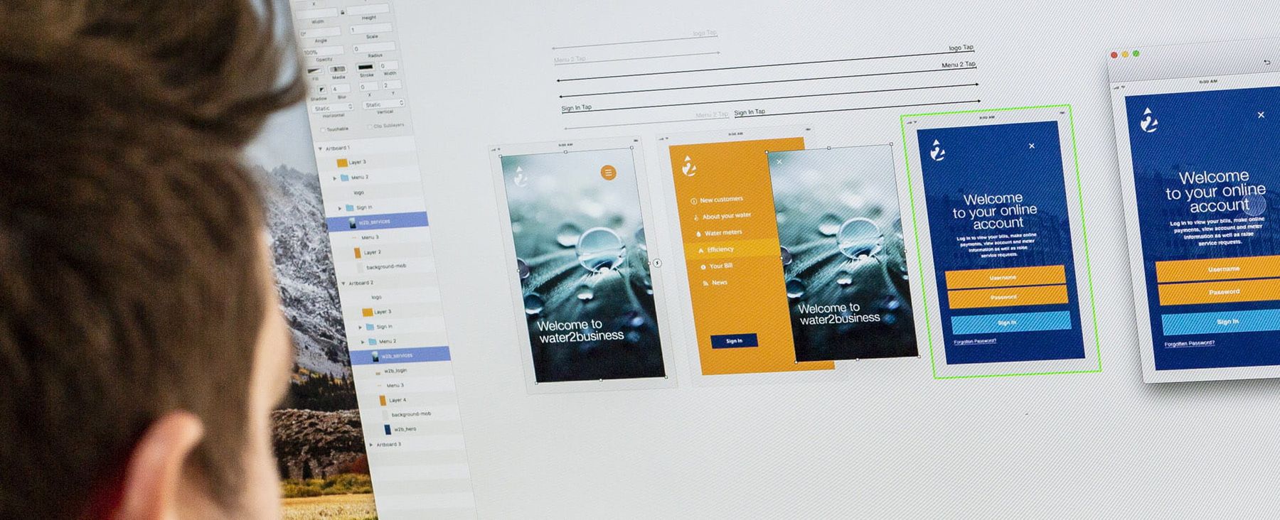
The phone at the top of this page shows it in practice. Staffline, the largest provider of blue collar recruitment in the UK, was finding it hard to source candidates. After a six week audit and workshops with clients and candidates, we rebuilt the website around the candidate rather than the client, mobile first. The homepage opens with "Find your next job with Staffline" and two boxes, what and where. Mark Underwood, Managing Director of Staffline Recruitment, said the new site "immediately increased both traffic and job applications". The headline was one small part of a much bigger rebuild, but it is what a candidate sees first. See the Staffline work.
Two tests for any headline
The logo swap
Could a competitor put their logo above your headline and have it still be true? If yes, it is not a headline, it is a category label. "Innovative solutions for a changing world" could sit on almost any website. Something only you could say, about a problem only your audience has, cannot be lifted and reused. That is the bar.
The say-it-back test
The second test is harder and more useful. Show the headline to someone who fits your audience, not a colleague who knows the answer, and ask them to say in their own words what you do and who it is for. If they hesitate, the line is working too hard to sound impressive and not hard enough to be clear. UX researchers run a version of this called the five-second test: show the page briefly, take it away, and ask what stuck.
| A headline that... | What the visitor hears | Try instead |
|---|---|---|
| Promises a vague outcome | This could be anyone | Name a specific outcome for a specific reader |
| Describes your category | A label, not a reason to stay | Say what only you could say |
| Talks about you and your passion | Your priorities, not theirs | Describe their situation in their words |
| Plays on words | A puzzle to solve first | Say it plainly and keep the wit for later |
Why clever loses to clear
There is a strong pull towards the clever headline: the pun, the abstract promise, the line that sounds like a brand campaign. It feels like better work. On a homepage it usually is not. Behavioural scientists call the mechanism processing fluency. When something is easy to take in, people tend to find it more familiar and more believable. A reader who has to decode your headline spends effort they would rather keep, and trusts the line a little less for it.
Plain does not have to mean dull. Conergy had a technical subject to explain, so we made an animation, Autarky, that promoted the benefit of solar in a "user-friendly, jargon-free and light-hearted style". Clear first, personality second. That is the heart of behavioural design: make the right thing the easy thing.
Where the right words come from
The best headlines are rarely written at a desk. They are found by listening to the people you want to reach, and noticing the words they use and the order they think in. That is human-centred design, and it is why our work starts with interviews rather than a blank page.
For Bush & Co, we interviewed the solicitors and insurers who actually choose them, asking how they used the firm and why they picked it over anyone else. Two of the themes that kept coming back matter here. The case managers themselves mattered most. And solicitors searched overwhelmingly by geography first.
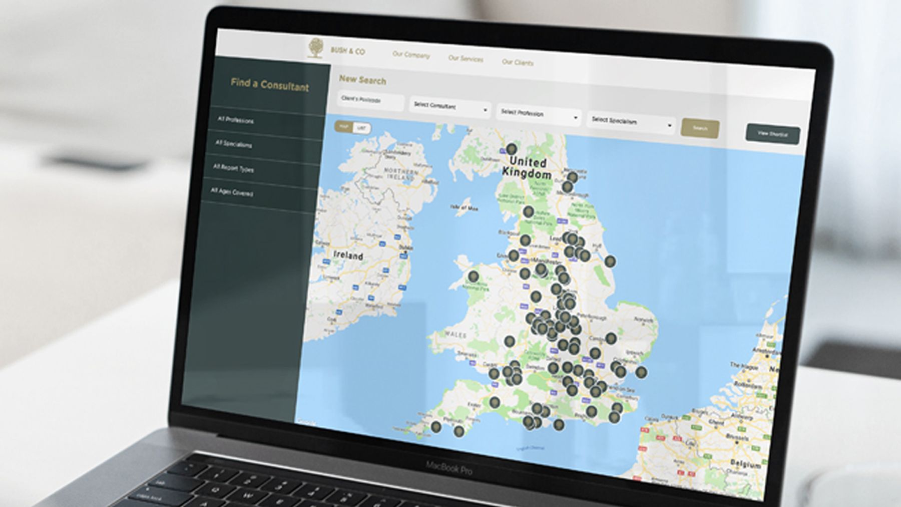
So the website was built around a consultant finder on a map, because that is how the people choosing actually search. The order came from the interviews, not from our taste.
Words work the same way. At HCML, the intermediaries we interviewed told us that real stories land harder than messaging built around services. You only learn that by asking.
I’ll be honest, plenty of agencies promise they’ll get to know your business. Ideate actually did it. They started with our customers rather than our logo, and the behavioural research they came back with told us things about how all our various customer groups choose a provider that we genuinely hadn’t seen before.
What goes under the headline
A headline cannot do everything, and it should not try. Its job is to make the right person stay. The line beneath adds the detail the headline left out. Then comes one clear next step: not three competing buttons, one obvious action, with anything else visibly quieter.
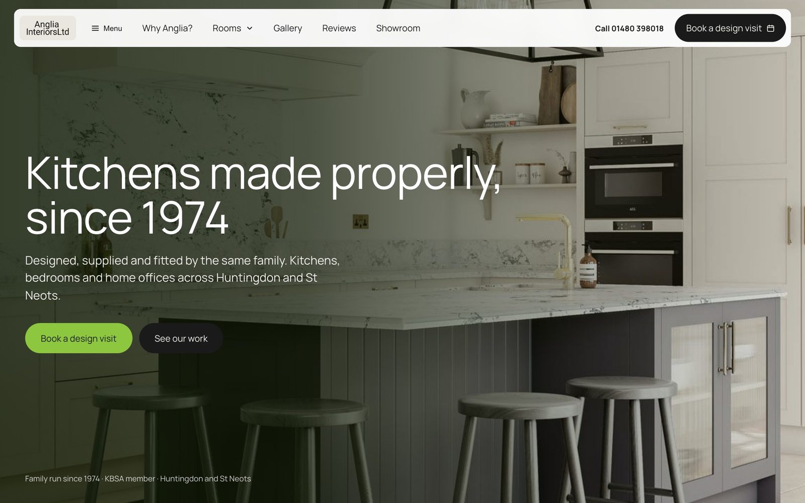
The Anglia Interiors homepage we designed shows the pattern. "Kitchens made properly, since 1974" says what they make and why to trust them. The line beneath adds who makes them and where. Then one green button, Book a design visit, the step every page leads to, with See our work quieter beside it. The words are Anglia's own. The design's job was to give them room. More on the rest of the page in how to write a homepage people actually read, and on the button in why one clear call to action beats five.
Rewriting yours in an afternoon
- 01Write down the first question
The one a visitor arrives with, in their words. If unsure, ask a few recent customers what they were looking for when they found you.
- 02Draft five plain versions
Each names the reader's situation or the outcome they came for. No puns yet.
- 03Run the logo swap
Cross out any line a competitor could sign unchanged.
- 04Run the say-it-back test
Keep the one people who fit your audience can explain back without help.
- 05Add the line beneath and one action
One sentence for the detail the headline left out, then a single next step.
The door, not the house
None of this means your homepage needs a rewrite from top to bottom. It means the first line deserves more thought than the other forty put together, because it does more work than all of them. Fix the headline and you often find the enquiries were never the problem. The door was just quietly shut.
If the headline is a symptom of a site that looks credible but does not explain the value, that is what a website redesign and good copywriting are for.
Common questions
How long should a homepage headline be?
Short enough to read in one glance, usually under ten words, but length matters far less than specificity. A longer line that names the reader's problem beats a snappy one that could belong to anyone.
Should the headline include our search keywords?
Where it fits naturally, yes, but never at the cost of clarity for a human. A headline written for a person who recognises their problem tends to contain the words they would search anyway.
How do we know if the headline is the problem?
Analytics can show that people leave the homepage, not why. If many do, run the say-it-back test. When a few people who fit your audience cannot tell you what you do and who for, the headline is at least part of the problem.