In this article
Ask ten people what a brand is and most will point at a logo. A few will say colours and a font. That is the costume, not the character.
A brand is the set of decisions that make you recognisable, and make you the obvious choice for the people you want. Those people might be buyers in other businesses, customers on the high street, donors, members or candidates. The visuals are the last and most visible of those decisions. They are not the first.
A brand is a set of decisions, not a logo
The distinction matters because it changes what you fix when the brand isn’t working. If a brand is a logo, the answer to every problem is a redesign. If a brand is a set of decisions, a redesign is sometimes the least important thing you could do.
Often the logo is fine and what has drifted is underneath. The organisation has grown, added services or changed who it serves, and nobody has gone back to make the decisions again. That is when a rebrand is worth doing, and it is the thinking that needs redoing, not only the artwork.
A brand is a set of decisions. The logo is where those decisions become visible, not where they’re made.
The decisions underneath
A real brand answers a handful of questions, out loud and on purpose. None of them is about design, and all of them end up in the design.
| The decision | The question it answers | Where people meet it |
|---|---|---|
| Who you are for | Who are we actually for, and who are we not for? | Your photographs, your words, where you turn up |
| What you stand for | What do we stand for that a competitor would not say? | Your headline, strapline, the first line of a pitch or appeal |
| What you are known for | What is the one thing we want people to remember? | What a happy customer says about you |
| What comes first | What do we say first, and what do we deliberately leave out? | Your homepage, opening slide, leaflet cover |
Get those right and the visual identity almost designs itself, because it has something specific to express. Get them wrong and the best-looking brand in the world is just well-dressed vagueness.
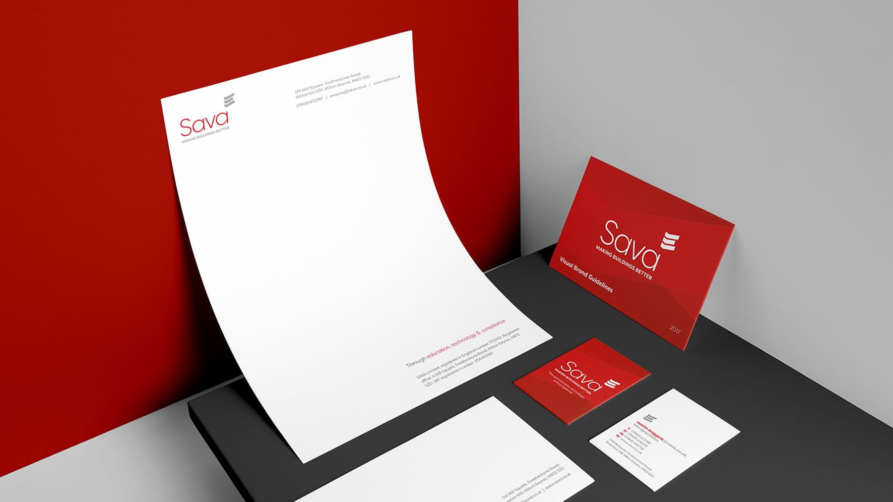
Sava shows the order in practice. National Energy Services had grown into several brands, divisions and websites. We started with a brand workshop with the senior team, plus competitor and market research. That gave a strategy setting out the company’s vision, values and a simpler service proposition. Only then came the new name, the identity and, later, one site in place of several.
Where the decisions come from
It isn’t taste. Plenty of brands are built on what the founder or the board happens to like, which is why so many end up looking confident and saying nothing. The better source is the people who choose you, and the reliable way to hear them is to ask.
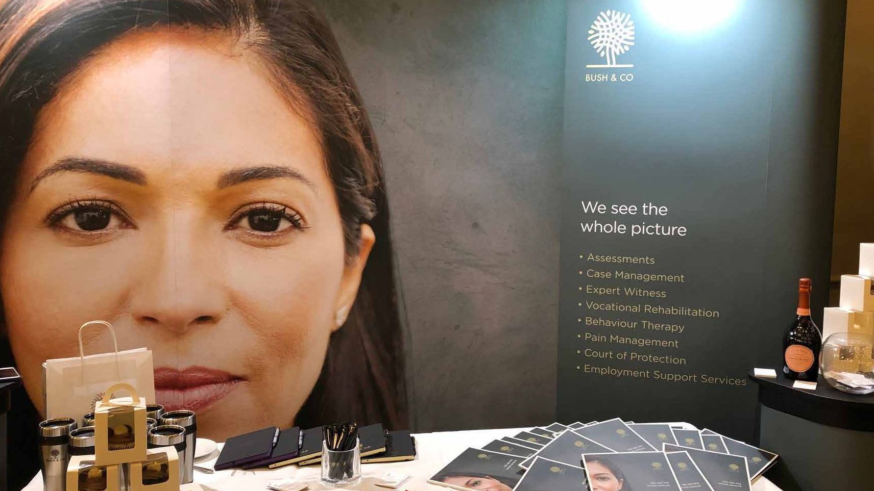
For Bush & Co, a case management and expert witness business, we interviewed and surveyed staff, case managers, expert witnesses, and the solicitors and insurers who choose them. Three themes kept coming back. Relationships rested on the quality and personality of the case managers. Solicitors searched by geography first. And they were cautious, needing a push to try someone new.
Those findings shaped the decisions. New brand values and a positioning statement came before any creative concept. The identity used a face and an eye to suggest focus, kindness and wisdom. The website got a consultant finder built on a map, to match how solicitors search.
This is what we mean by human-centred design. It is slower than picking a look you like, and it is why the look ends up meaning something. HCML started the same way, and its marketing manager put it better than we could.
They started with our customers rather than our logo, and the behavioural research they came back with told us things about how all our various customer groups choose a provider that we genuinely hadn’t seen before.
What a brand isn’t
- It isn’t a mission statement that nobody outside the building has read. If it doesn’t change what you say to a customer, it isn’t doing the job.
- It isn’t consistency for its own sake. Being reliably bland is still bland.
- It isn’t fixed by volume. When a brand feels tired, the instinct is to make it louder: bigger claims, more colour, a punchier strapline. If the decisions underneath are muddled, louder just broadcasts the confusion further.
A brand earns its keep by making a specific promise to a specific person and keeping it everywhere they meet you. The work is deciding what you are, for whom, and why you, then making everything say that one thing.
The honest test: can people repeat you?
A working brand is repeatable. A happy client, describing you to a colleague or a friend, uses roughly the words you would choose. That only happens when the brand stands for something specific enough to repeat. “They’re good” is not a brand. “They’re the ones who actually research your customers before they design anything” is.
Repeatable matters for the people who carry your brand, too. Table Tennis England wanted a brand to take ping pong to workplaces, universities, sports clubs and cafes, rolled out by its own ambassadors. The brief was a set of decisions as much as a look: fun, engaging, the joy of the game and a sense of inclusion. Alongside the Loop identity we created the mission, vision, values and guidelines, and toolkits on key messaging and tone of voice, so other people could say it the same way.

Before you commission a new logo
Before you brief a designer, check the decisions underneath. Often they aren’t clear, and that is the real brief.
- 01Ask three people who chose you
How would they describe you to a friend? Write down their exact words, not your summary.
- 02Write your own answers
On one page, answer the four questions in the table above.
- 03Compare the two
Where their words and yours match, you have a brand. Where they don’t, you have found the work.
- 04Check the first thing people see
Your homepage, opening slide or leaflet cover. Does it say the first thing first?
- 05Then brief the design
Give a designer the decisions, not a mood board.
The logo is the easy part once the thinking is done, and an expensive distraction when it isn’t. Our guide to what brand strategy is shows how the decisions fit together, and brand strategy is where we make them with you. If a second pair of eyes would help, we are happy to talk it through.
Common questions
Do we need a rebrand or just a refresh?
It depends on whether the decisions underneath have changed or just the look has dated. If who you are for and what you stand for still hold, a refresh of the expression is usually enough. If those have shifted, that is a rebrand, and no amount of visual polish substitutes for redoing the thinking.
The two can also meet. For Sayfa Systems we ran a brand workshop and research and proposed a new strategy, but Sayfa did not want to move far from its original logo, so the new identity stays close to it, with a suite of enhancements to modernise the brand. More in rebranding without throwing away what already works.
What is the difference between brand and marketing?
Brand decides what you stand for and why you are the choice. Marketing gets that in front of the right people. Brand is the thing being communicated, marketing is the communicating. Skip the first and marketing has nothing true to amplify.
Is a proper brand only worth it for bigger organisations?
No. The expensive part is the execution, not the thinking, and the thinking is where most of the value is. A small firm or a new venture with clear decisions about who it is for and why it is different will out-brand a bigger competitor with a prettier logo and no point of view.
Does this apply to charities and the public sector?
Yes. A charity or public body still competes for the attention and trust of the people it needs, whether donors, volunteers, members or the public. The four questions are the same; the answers are about a cause or a service rather than a product. Safe Rugby, the brand and e-learning portal we made for the NHS and the RFU, was built around a clear answer to the first: referees and medical staff at clubs across the UK.