In this article
A confusing website rarely announces itself. Nobody emails to say they got lost and gave up. They just leave, and you never see them. That is exactly why confusion is such an expensive problem: it’s invisible.
What you do see is the result. Fewer enquiries, fewer bookings, fewer applications, fewer donations. So you reach for the obvious explanations: more traffic, better SEO, a bigger campaign. Meanwhile the leak was in the part people had already reached.
Why nobody tells you
Confusion doesn’t frustrate people into complaining. It quietly raises the effort of understanding you past the small amount they were willing to spend, and they move on. Every extra moment of “wait, what do they actually do?” or “where do I go for this?” loses a few more of the people who were nearly yours.
It works the same way whoever is visiting: a finance director comparing suppliers, a family choosing a kitchen, a supporter wondering where their money goes. Each arrives with a question and a little patience. In behavioural design terms, every extra bit of effort is friction, and friction changes what people do. When understanding you costs more than they expected, they go back to the search results, where someone else is one tap away.
Your analytics won’t flag it either. They record that a visit ended, not why. A person who found what they needed and a person who gave up in confusion can look the same in a report.
What confusion looks like
It’s seldom one big thing. It’s an accumulation of small ones.
| What is on the page | What the visitor is thinking | What usually fixes it |
|---|---|---|
| A homepage that says six things | Which of these is the main thing? | One message first, the rest in support |
| Menus named after your departments | Where would they have put what I want? | Labels in the words visitors use |
| A proposition that takes three paragraphs to arrive | What do they actually do? | Say it in the first line |
| Jargon that means something to you | Is this for someone like me? | Plain words, tested on outsiders |
| A contact journey with more steps than patience | Is this worth the effort? | Fewer steps, one clear next step |
| Several sites or brands for one organisation | Am I in the right place? | One front door, with routes inside |
Individually, each is forgivable. Together, they add up to a site that’s hard work to understand, and hard work is the thing people avoid. The first line matters most, and has a piece of its own: why your homepage headline is costing you enquiries.
Organise it the way visitors think
Most confusing navigation is an organisation chart in disguise, clear from the inside and baffling from the outside. The fix is to find out how the people using the site actually look for things, and build around that.
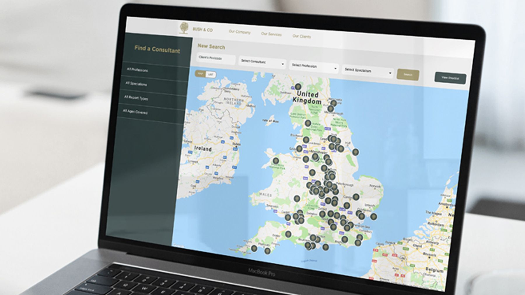
When we interviewed the solicitors and insurers who choose Bush & Co, one recurring theme was simple: solicitors searched for a consultant by geography first. So we built a consultant finder on a visual map, filtering by specialism, geography and experience. That is human-centred design in practice: asking, rather than guessing.
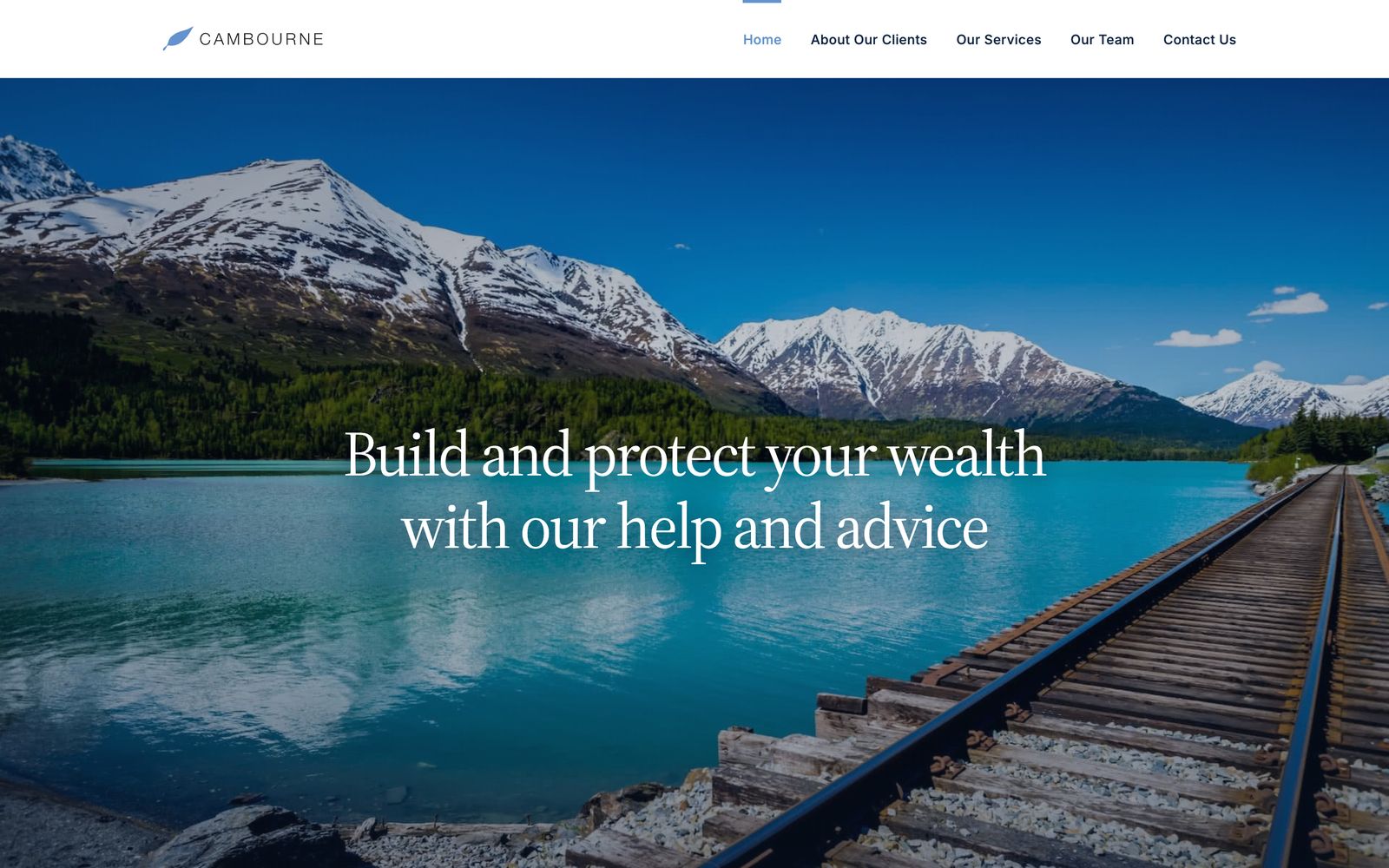
HCML has two connected sides: rehabilitation and case management for insurers, solicitors and the public sector, and occupational health for employers. We rebuilt the site around both, and the menu now opens with each in the visitor’s terms: Workplace Health, and Personal Injury & Clinical Negligence.
Confusion is the most expensive problem a website has, because the people it costs you never tell you.
Why adding more makes it worse
The instinct, when a site isn’t working, is to add: another section to explain, another reassurance, another call to action in case the first was missed. Each addition feels helpful and makes the confusion worse, because clarity comes from less, not more. A page that asks the visitor to hold six messages at once is harder than one that asks them to hold one.
The hardest and most valuable work on most websites is subtraction. Fewer messages, fewer choices, fewer steps between a person and the thing they came for.
Sava shows it. National Energy Services had grown into several brands, divisions and websites: strong individually, but confusing as a whole. The answer was not another page explaining how they fitted together. It was one name, then one corporate site in place of several, built to explain the offer clearly to each audience.
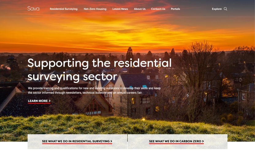
Hayley and Simon have brought clarity to our positioning, consolidating our range of brands and services under one name and vision creating a strong, professional but dynamic brand.
Plain words for people with little time
Jargon is the quietest kind of confusion, because you can’t hear it in your own voice. Every sector has words that feel precise inside the building and opaque outside it, so finding the plain version is often a copywriting job before it is a design one.
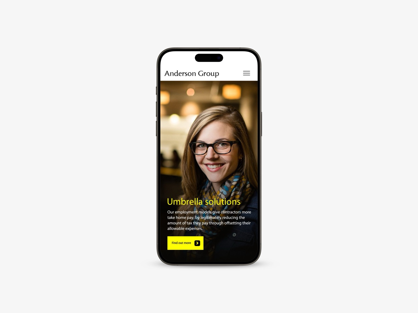
Anderson Group sells payroll, outsourcing and accountancy services, complicated by nature, to contractors and recruiters with little time or interest in the subject matter. We simplified the product offering first, then built a website with a journey mapped for each kind of visitor. Mobile got priority, because it was contractors’ main channel.
Fewer steps to the thing they came for
Sometimes the confusion is in the doing, not the reading. At Staffline, candidates were struggling twice: first to find jobs through search engines, then to apply even when they did. The new site put the job search first, streamlined application and registration, and added simple icons for browsing jobs by sector or industry.
A family business that designs and fits kitchens needs the same discipline. On the new Anglia Interiors site, every page leads to the same next step, a design visit. More on that in why one clear call to action beats five.
Fix the clarity before you buy the traffic
Here’s the part that should change the budget conversation. Removing confusion is almost always cheaper than buying more traffic, and it compounds.
If your site converts a confused trickle of visitors, every pound spent driving more traffic pours more people into the same leaky funnel. SEO and paid campaigns bring people to the door. They can’t explain you once people are inside. Fix the clarity first and the traffic you already have starts to work, before you spend anything on getting more.
Try the five-second test
It takes one person and a few minutes.
- 01Find someone who fits
A person who could be a customer, supporter or candidate, and has never seen the site.
- 02Show the homepage for five seconds
On a phone, if that is how most of your visitors arrive. Then take it away.
- 03Ask three questions
What do we do? Is it for someone like you? What would you do next?
- 04Write down their words
Not your summary of them. Where their answer and yours differ, you have found the confusion.
- 05Repeat on the pages that matter
A key service page, the contact page, and the page most people land on from search.
The test is simple and unforgiving. If a first-time visitor can tell, in a few seconds, what you do, whether it’s for them and what to do next, the site is doing its job. If they can’t, no amount of traffic will save it, and the people it’s costing you will keep leaving without a word.
If a second pair of eyes would help, our free marketing audit reviews your website and marketing and comes back with three things you could fix this month. No pitch, no tie-in. When the problem runs deeper, a website redesign rebuilds the site around what your visitors need to understand. We’re happy to talk it through whenever suits.
Common questions
How can I tell if my website is confusing?
Show it to someone who fits the people you want to reach and hasn’t seen it, for five seconds, then ask them what you do, who it’s for, and what to do next. If they can’t answer confidently, that’s your answer. Your own team is too close to judge.
Is a confusing website a design problem?
More often it’s a clarity-of-thinking problem wearing a design costume. If the proposition and priorities aren’t clear, a redesign just rearranges the confusion. Sort what you’re saying first, then how it looks. That thinking is what brand strategy is for.
Should we fix the website or spend more on traffic?
Fix the site first. More traffic into a confusing site just loses more people more expensively. Clarity makes every visitor you already have worth more, which is the cheaper win.