In this article
People don't read homepages. They scan them, deciding in seconds whether it is worth slowing down. Most homepage copy is written as if the opposite were true: dense paragraphs, a full company history, everything the organisation wants to say, arranged in the order it occurred to them. The result is a page that would reward careful reading and gets none.
Writing a homepage people read means designing for the scan first and the read second. That holds whether you sell to other businesses, sell to the public or run a charity asking for support. The eye lands on the headline, bounces to the subheads, catches the bold bits, and only commits to a paragraph if those have earned it. So the structure has to tell the whole story on its own, before a single body sentence is read.
How people really meet a homepage
Scanning is not laziness. It is what anyone does when they arrive with a question. A visitor wants to know quickly whether they are in the right place, so they look at the parts most likely to tell them: the big words, the short lines, anything that stands out from the grey.
The usability researcher Jakob Nielsen was measuring this in the 1990s.
- 79%of the people in Nielsen's usability tests always scanned a new web page; only 16% read it word by wordJakob Nielsen, How Users Read on the Web, September 1997
- 28%of the words on an average web page is the most a visitor has time to read in a typical visit, and 20% is more likelyJakob Nielsen, How Little Do Users Read?, Nielsen Norman Group, May 2008
The skeleton test
Here is the quickest check we know. Read only your headline and your subheadings, nothing else. Do they, by themselves, tell a visitor what you do, who it is for, and why you? If they do, the page works even for the many who never read a paragraph. If they don't, you have hidden your message in body copy that most people will never reach.
The skeleton is the message. The paragraphs are for the few who want more.
Write so the headline and subheads tell the whole story. The paragraphs are a bonus, not the plan.
The homepage at the top of this article passes. We designed and built the Peoples' Climate Vote site for the United Nations Development Programme's poll on climate change, and the brief asked it to explain what the vote is and to work simply on a phone. The headline does most of that on its own: 1.2 million people, 50 countries, one vote. One paragraph says how the vote reached people and what they were asked. One button says Explore the map, and every result sits two taps from the homepage.
Most homepages fail the test for the same reason. Their subheadings are labels: About us, Our services, Why choose us. Each tells you what kind of section is coming, never what it says. Here is a made-up example, a small accountancy firm, written both ways.
| Label subheading | Subheading that tells |
|---|---|
| Welcome to our practice | Accounts and tax for small firms, done before the deadline |
| Our services | Year-end accounts, VAT and payroll in one place |
| Why choose us | You speak to the same accountant every time |
| Contact us | Book a half-hour call to talk it through |
Read the left column alone and you learn nothing. Read the right and you know what the firm does, who for, why them and what to do next.
One section, one point
Each section should make one point, and the reader should be able to tell what it is without reading it fully. The moment a block tries to say three things, it says none of them clearly.
This mattered for Anderson Group, a global outsourcing and payroll business whose offer was so varied it risked losing the contractors and recruiters it served. The benefits had to land quickly with people who had little time or interest in the subject. We ran workshops with the senior team to streamline the products, then built a website that mapped out a journey for each kind of visitor. Mobile was the main channel for contractors, so the phone came first.
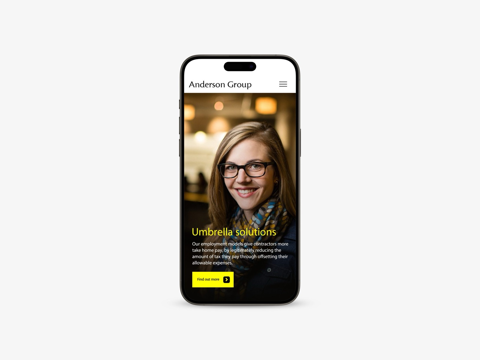
The subheading names the service, one sentence says what contractors get, and one button leads on. Nobody has to read anything they did not come for.
The website is a real standout. It’s cutting-edge, beautifully considered and genuinely a pleasure to use, the kind of experience that makes people want to stay and explore.
Their words, not yours
Short sentences. Concrete words. The reader's language, not the industry's. Every sector has its own shorthand, and it creeps onto homepages because the people writing them use it every day. Visitors don't. They describe their problem in their own way, and they scan for those words.
You find them by asking. Talk to a handful of recent customers, donors or service users and listen to how they describe what they needed when they found you. The phrases that keep coming back are your subheadings. It is the simplest form of human-centred design, and it is why our copywriting and content work starts with people rather than a blank page. For the line at the very top, see why your homepage headline is costing you enquiries.
Let the page breathe
White space isn't empty. It is what lets the eye move and the message land. A homepage packed edge to edge with copy looks like hard work before anyone reads a word.
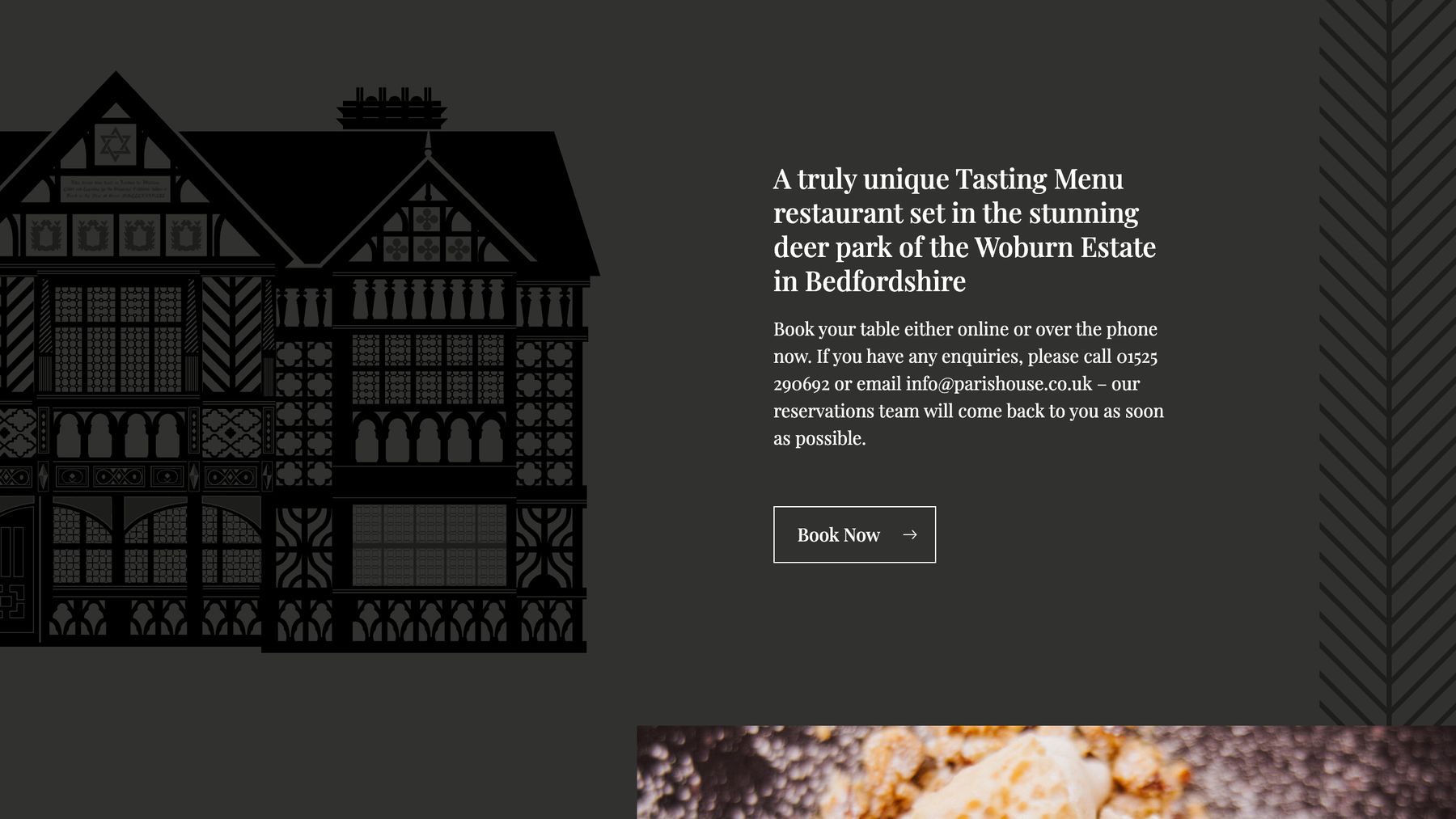
Pictures can carry part of the load. For Paris House, a fine dining restaurant set in a deer park in Bedfordshire, the strength of the site was always going to be the photographs of the food and the setting. So we let large images do most of the talking and showed the experiences rather than describing them. The words that remain are few, and each has room around it.
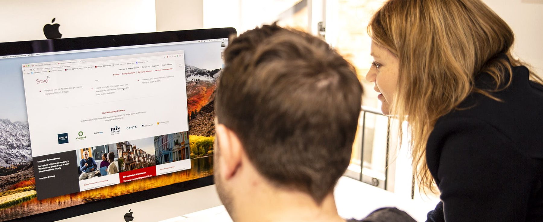
Film can do the same job. When we brought several websites under one corporate site for Sava, short film clips gave visitors a quick way into the more complicated parts of the offer. Not everything has to be said in words.
Then cut
The first draft always says too much. Every sentence you remove makes the ones that remain easier to read. A homepage isn't where you say everything. It is where you say the one thing that earns the click to say more.
Cutting is easier when you know where the detail will live. The full history belongs on the about page, the service detail on service pages. The homepage points to them, and asks for one thing above all, which is the subject of why one clear call to action beats five.
Rewriting yours in five steps
- 01Write the skeleton first
Draft the headline and one subheading per section before any body copy. Read them alone. They should tell the whole story.
- 02Give every section one job
Write its point in one sentence. If it needs an "and", split the section or cut half of it.
- 03Swap in their words
Replace industry terms with the phrases customers use for the problem. If you don't know them, ask.
- 04Write the paragraphs for the few
Short sentences, concrete words, nothing a curious reader would miss.
- 05Cut, then test
Take out anything that repeats. Then ask someone who fits your audience to read the skeleton and tell you what you do and who for.
Sometimes the test shows a bigger problem: a site that looks credible but does not explain the value. That is what a website redesign is for. To start smaller, our free marketing audit comes back with three things you could fix this month.
Common questions
How long should homepage copy be?
There is no right word count. A long homepage works if every section makes one clear point and the subheadings carry the story. A short one fails if its few words are vague. Judge it by the skeleton test, not by length.
Should we write the homepage first or last?
Usually last, or at least after the main pages are drafted. The homepage summarises and signposts, and it is much easier to write once you know what it points to.
Does any of this change on a phone?
The principles are the same, but it matters more. A phone shows one section at a time, so each subheading has to stand on its own. Review the page on a phone as well as a laptop. Your analytics will show how many visitors arrive that way.