In this article
Some things really are complicated. A water market opening to competition for the first time. Solar power at commercial scale. Payroll and outsourcing, explained to contractors. Survey data on household energy, made readable. None of these fits in a one-liner.
The temptation, when the subject is this involved, is to go one of two ways. Either drown people in technical detail to prove you know it, or retreat into vague, reassuring fluff that says nothing. Both lose. One overwhelms; the other underdelivers.
Two ways a complex offer loses people
| Drowning in detail | Retreating into fluff | Clarifying | |
|---|---|---|---|
| What it looks like | Every feature, standard and acronym on the first page | Warm words about partnership, innovation and solutions | The two or three things that matter to this reader, in their words |
| What it protects | The expert’s credibility | The organisation, from being pinned down | The reader’s time |
| How it reads | Like homework | Pleasant and forgettable | Like being understood |
| What people do next | Put it off, or pass it to someone else | Struggle to tell you apart | Take the next step, or know what to ask |
Fluff is the harder failure to spot from the inside, because it sounds professional. Detail at least proves there is something there.
Clarifying is not dumbing down
The harder, more useful path is to do the work of simplification for the reader. Not dumbing down, which hides the substance, but clarifying, which reveals it.
That means deciding what each audience actually needs to understand and believe to move forward, saying exactly that in their language, and leaving the rest for when they ask. The detail doesn’t disappear. It moves to where the people who want it will look: a spec sheet, a second page, a conversation with an engineer.
Clarity isn’t dumbing down. It’s doing the hard work of understanding so the reader doesn’t have to.
The word “each” matters. A complex offer rarely has one audience. The person who signs off the budget, the person who will live with the decision and the specialist who checks the detail all need different things first. Serving all three in one paragraph is how you end up drowning everyone in detail.
When the water market opened
When the water market deregulated, businesses could choose their water supplier for the first time. Wessex Water and Bristol Water set up a new venture, water2business, to compete, and asked us to create the brand and proposition from scratch.
The challenge wasn’t a lack of information. It was too much of it, wrapped in regulatory language nobody outside the industry spoke. The job was to simplify the messages of regulation change and make water supply matter to a busy finance director or facilities manager.
So the work came in layers. A website set out the proposition, explained the legislation and mapped a clear journey for current, new and prospective customers. An information hub gave balanced, objective information on what the change could mean for a business. Campaigns went to the sectors most affected, each with its own editorial, films, animations and infographics. Seminars with businesses across the South West turned the discussion into a white paper.
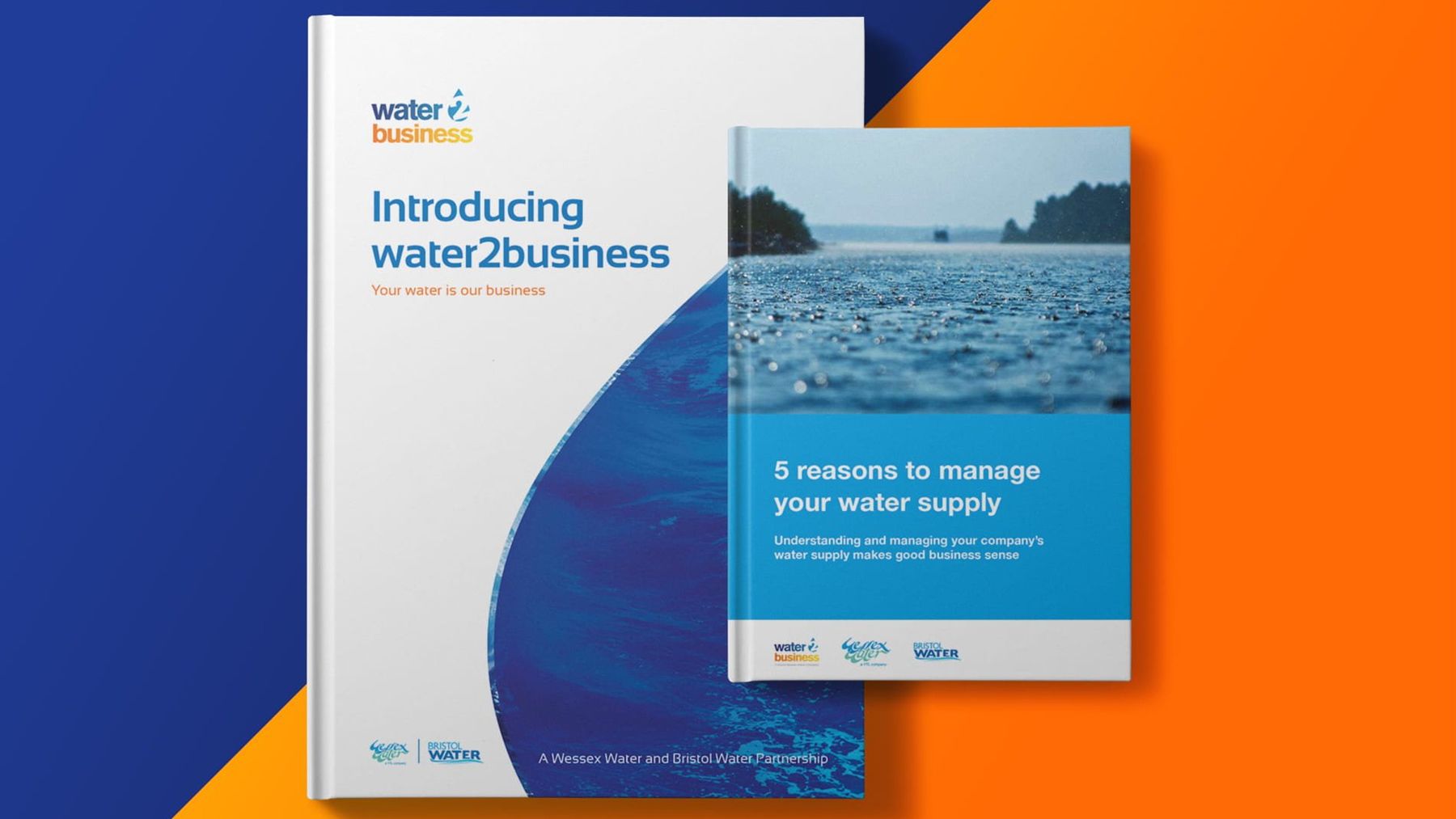
Notice that simplifying produced more material, not less. Each sector got the part of the story that was about them. The complexity stayed real; the message got clear.
Why the clearest firm tends to be trusted
Here’s the commercial point. In a technical market, the firm that explains itself most clearly is usually trusted most, because clarity signals mastery. Anyone can hide behind jargon. Only someone who truly understands a thing can make it simple.
When Conergy arrived in the UK, it had a global reputation in solar and a crowded, technical market to win. Standing out wasn’t about claiming more expertise. It was about making the expertise legible. We proposed powering its UK website from one of its own installations, running on solar, wind and battery, with visitors able to see the energy and the savings in real time. The proof was something you could watch rather than read.
A panoramic virtual solar farm let people move around the screen to see how one works. An animation called Autarky explained the benefit of solar in a jargon-free, light-hearted way.
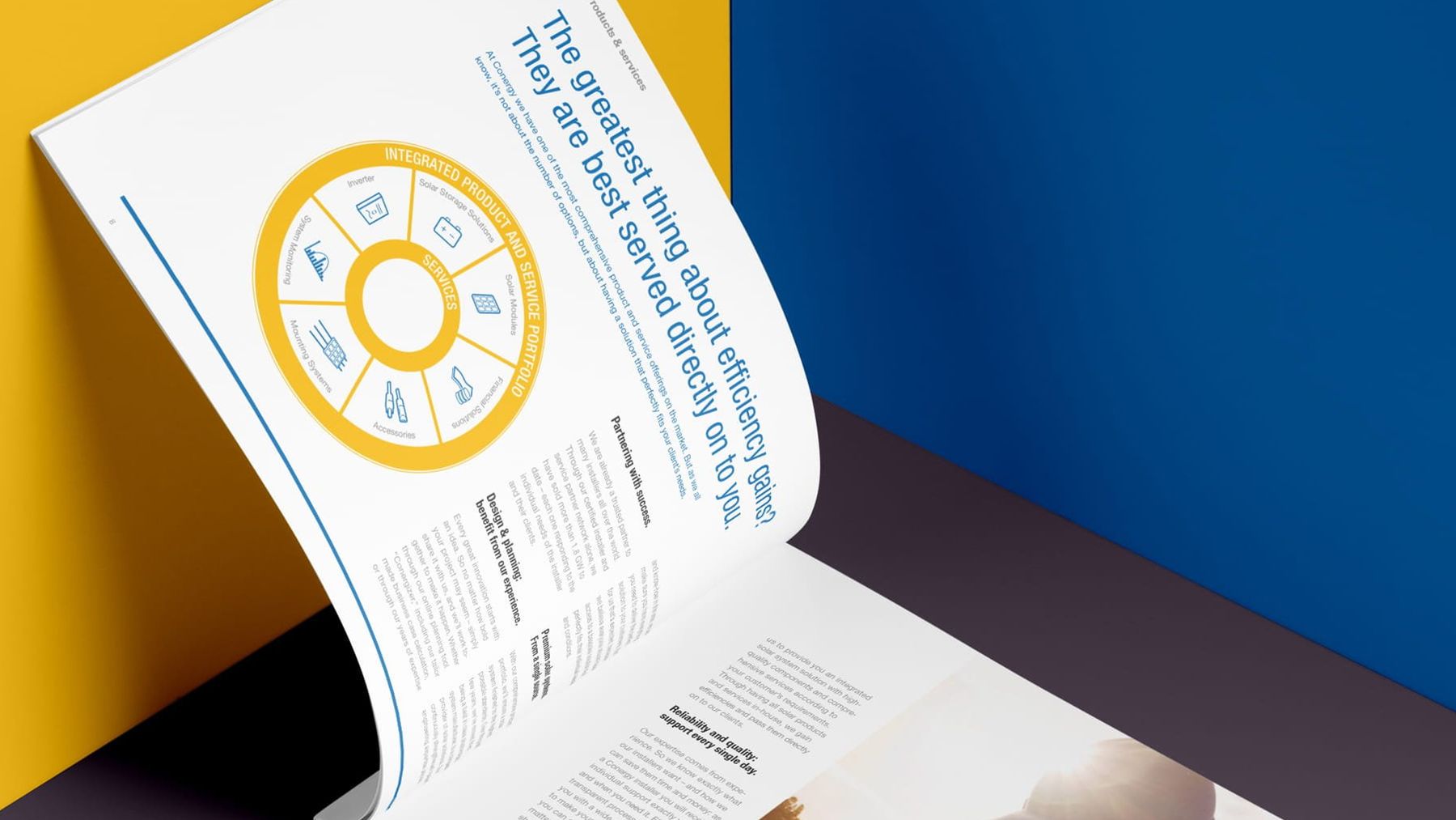
That is what film and animation and infographics are for when the subject is hard: not decoration, but a quicker route to understanding than a page of text.
When the complexity is your own making
Sometimes the subject isn’t the hard part. The organisation is.
National Energy Services had grown into several brands, divisions and websites, strong individually but confusing together. After a workshop with the senior team and research into the market, we brought everything under one name, Sava, with one identity and one site that explained the offer to each audience. Film clips gave a quick way into the more complicated parts.
Hayley and Simon have brought clarity to our positioning, consolidating our range of brands and services under one name and vision creating a strong, professional but dynamic brand.
The Anderson Group, a global outsourcing and payroll business, had a product range so varied it risked losing the contractors and recruiters it served. Workshops with the senior team streamlined it into an offer that made sense to the end user. Films and animations then debunked the myths of outsourcing for people with little time or interest in the subject.
In both cases the fix started with positioning and messaging, not design. Design came second, and carried it.
Not only a business problem
Complex offers aren’t confined to business buyers. Charities, public bodies and consumer brands face the same choice between detail and fluff, often with an audience that owes them even less attention.
The Energy Saving Trust is an independent organisation working to address the climate emergency. Our work with them included reports, fact sheets, guides and infographics, with animation, film and photography used to bring the data and the copy to life.
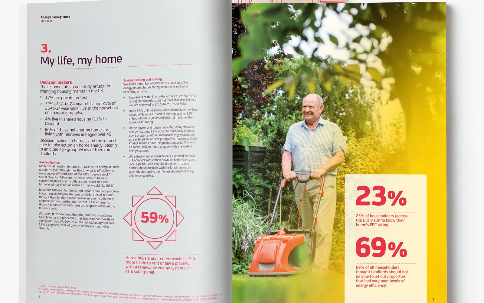
A plain heading, one person and two findings set large, with the detail kept on the facing page for anyone who wants it. It is the same discipline as the water and solar work, applied to a different reader.
How to simplify a complex offer
There is no trick, but there is an order. Roughly, ours is this.
- 01Name every audience
List each group who has to understand the offer, separately. A finance director and a facilities manager are two readers, not one.
- 02Ask them, don’t guess
Talk to a handful of each. Note the words they use and the questions they ask first. That is your vocabulary, not the industry’s.
- 03Write the one thing
For each audience, write what they need to understand and believe to take the next step. If it takes a paragraph, keep cutting.
- 04Show the whole first
Give the offer one shape people can hold, such as a wheel, a map or three headings, and hang the detail off it.
- 05Layer the depth
Put the technical detail one click or one conversation away, where the people who want it will find it.
- 06Make the proof visible
Find something people can see, watch or try, so the claim doesn’t rest on your word alone.
- 07Test it on a newcomer
Give it to someone outside the industry for two minutes and ask them to explain it back. Where they stumble is the work.
Step two is where most of the value sits, and the one most tempting to skip. What good discovery actually looks like covers how to do it well, and it is the heart of our human-centred design work.
The test
So the test for a complex offer isn’t “have we shown how much we know?” It’s “could the right person understand what matters in a couple of minutes and feel confident deciding?”
If yes, the complexity is working for you, as proof that you know your subject. If no, it’s a wall between you and the sale, the sign-up or the donation. We look at what that wall costs in the real cost of a confusing website.
If your offer is stronger than your ability to explain it, we’d be glad to talk it through.
Common questions
Won’t simplifying make us look less expert?
Usually the opposite. Jargon is easy to produce. A clear explanation shows that someone understands the subject well enough to choose what matters.
Can a film or an infographic do the explaining for us?
They help, but only once you know what you’re saying. A film made before the message is clear just animates the confusion. Settle what each audience needs to understand first, then pick the format that gets it across fastest.
Where do we start?
With the people who decide. A few honest conversations with them will tell you what to cut faster than another internal draft. If you’d like an outside view first, our free marketing audit comes back with three things you could fix this month.